10 Best Business intelligence Tools for Collaborative Data Analysis and Business Improvement [2025]
Written by The Count Team
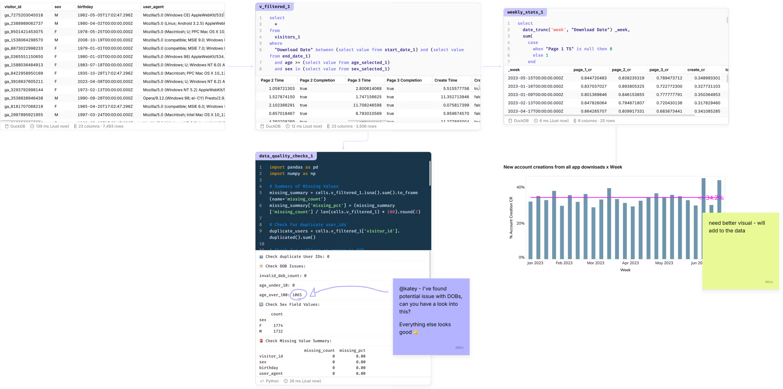
Discover the top 10 BI tools for seamless team collaboration, enhancing data analysis and business intelligence with real-time editing and stakeholder integration.
Let me save you some time: most BI tools are built for solo artists, not bands.
And your data team? You’re the power trio - and tour CEO is trying to orchestrate you and every other diva into some coordinated sort of Live Aid thing.
But you know the pattern. Someone spends three weeks building a dashboard. They publish it. Stakeholders send feedback via Slack. The analyst updates it. Rinse, repeat. Meanwhile, everyone pretends this is "collaboration."
Spoiler: it's not.
If you’re looking to make data analysis and business intelligence a team sport, you should be evaluating tools using the following collaborative dimensions:
- Version Control: Ability to track, revert, and audit changes to reports or data.
- Real-Time Multi-User Editing: Multiple contributors can edit together—support for synchronous or asynchronous involvement.
- Commenting and Discussion: In-context chat, annotation, or notes on visuals for stakeholders and analysts.
- Role Configuration and Access Control: Manage permissions for editing, viewing, or sharing at granular report or dataset levels.
- Stakeholder Integration: Integration with daily collaboration tools (Slack, Sheets), embedding workflows into business processes.
Below, we've shortlisted the BI tools that are popular with analysts and widely adopted in business. We looked at how well they deliver truly collaborative capabilities, and avoid transactional analyst-to-stakeholder exchanges.
Here are the 10 that made the cut:
- Count
- Tableau
- Power BI
- Qlik Sense
- Looker
- Domo
- Sisense
- SAP BusinessObjects
- IBM Cognos Analytics
- Yellowfin BI
1. Count

Turns out, you can build a BI tool where people actually work together. Who knew? Count is what happens when you stop pretending sequential workflows are collaboration and start building for how teams actually want to work.
Real-time, multiplayer data exploration. Not "publish and wait for feedback."Not "one person edits while everyone else watches." Actual simultaneous collaboration where analysts and stakeholders build insights together.
Watch queries update live. Jump into discussions without leaving the analysis. Add context, ask questions, build on each other's work—all without the asynchronous email tennis that plagues every other tool. And here's the part that actually matters: stakeholders participate in the analysis, not just the feedback loop. Your PM can explore data alongside your analyst. Your engineer can jump in with a technical question. Your exec can drill down when something looks weird.This isn't a feature. It's a completely different way of working.
Pros
- The only multiplayer, real-time collaboration experience with analysts, stakeholders, and AI agents.
- True flexibility to put your business context and metrics together in one place, and share reporting in Slack and email.
- Innovative local DuckDB usage to make canvases and reports responsive.
- Python, SQL, and low-code/no-code tables + visualizations in a single tool
- First-class comments, discussions, and canvas overviews.
Cons
- It’s a different way of working. You can still build dashboards, but to get the most out of Count you should build canvases that simplify systems down rather than just reporting on them.
- To help both stakeholders and analysts move fast, you need to build or import your semantic models into Count Metrics catalogs.
- Being able to combine data sources in one place makes it easy to write big queries
- Cloud and in-browser only.
2. Tableau
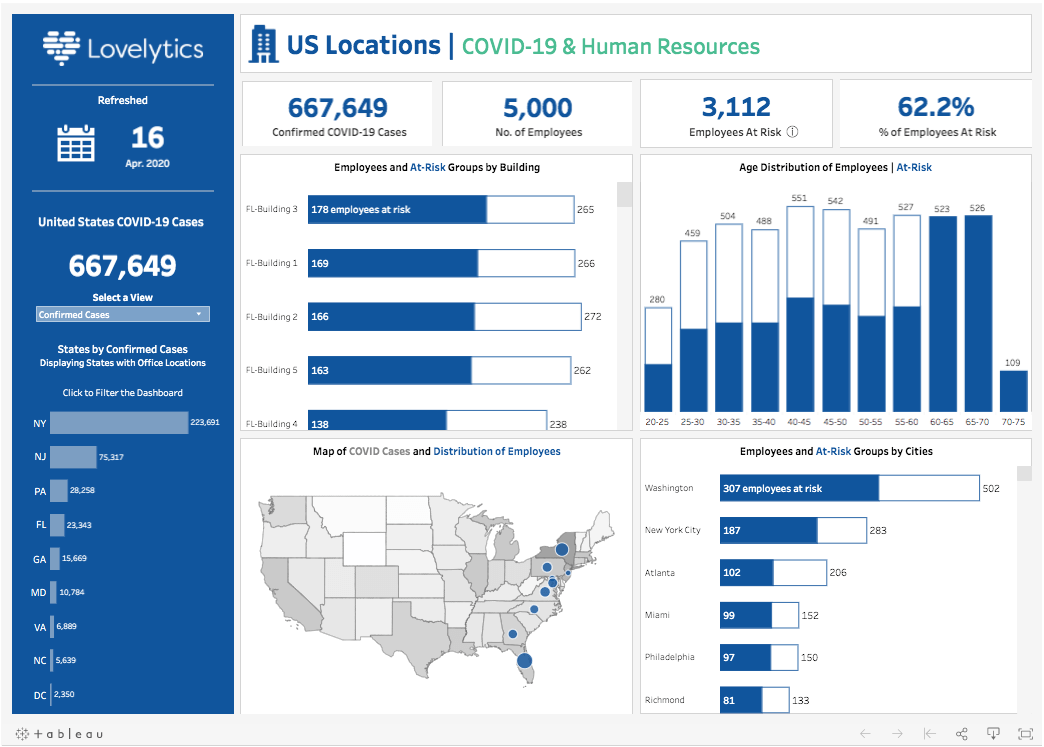
Tableau makes gorgeous dashboards. Truly stunning. But try having two people work on the same workbook? Good luck.
You're stuck passing .twb files around like it's 2008. One person edits, saves, emails it to the next person. Comments exist, sure—but you can't actually build together. The workflow is sequential, not collaborative. Git integration? Technically possible if you enjoy wrestling with XML files and making your non-technical teammates cry.
Translation: Tableau is a visual powerhouse that drives push workflows, not conversations. Everyone stares at the same beautiful dashboard and emails their thoughts later.
Pros:
- Excellent and intuitive data visualization features.
- Flexible dashboards and visual exploration for technical users.
- Offers various sharing options: Viewer, Explorer, Creator.
- Large selection of connectors and well-managed security controls.
- Extensive support and training resources.
Cons:
- No real-time multi-user editing: Teams must work on .twb files sequentially, limiting collaboration and version control.
- Fragmented collaboration: Comments exist, but development is not simultaneous.
- Basic version control: Workbooks are XML files; attempts to use Git are cumbersome for non-coders.
- Can struggle with large datasets; extracts are not always current.
- Lacks autosave and true script-based data prep, limiting support for advanced analytics workflows.
Summary: Tableau is a visual powerhouse but often drives “push” workflows rather than conversational analysis, making true collaborative processes tedious and transactional.
3. Power BI

Power BI integrates beautifully with everything Microsoft. Which is great if your world is Excel, Teams, and SharePoint. Less great if it's not.
The collaboration story? One person edits at a time. Version control is manual and terrifying. DAX formulas scare normal humans. And good luck explaining to a PM why they need to understand star schemas just to answer "how many customers churned last month?"
The workflow is publish → feedback → republish. Emphasis on the arrows, not the working together part.
Reality check: Power BI facilitates reporting. Teamwork is someone else's problem.
Pros:
- Deep integration within the Microsoft ecosystem.
- Supports direct SQL connectivity, robust dashboards, and visualizations.
- Affordable “Pro” tier for smaller companies.
- Mobile, desktop, and cloud deployment options.
- Large user community and frequent updates.
Cons:
- Minimal real-time collaboration: Only one author can edit a report at a time; versioning is manual and error-prone.
- Collaboration is “publish and feedback” not “co-edit.”
- Complex interface: Non-technical users may struggle with DAX, interface overload and navigation, especially with large datasets.
- Sharing and collaboration depend on Power BI Service; editing needs paid online access.
- Limited compatibility with non-Microsoft data sources and real-time external connections.
Summary: Power BI facilitates reporting more than teamwork. Its workflow favors individual building/publishing, then review, which delays insight iteration and feedback.
4. Qlik Sense
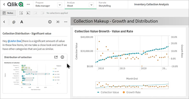
Qlik's associative engine is legitimately clever. Click one thing, everything related lights up. It's intuitive for exploration... if you're the one person who built the app.
Multi-user editing? Nope. One developer at a time. Want to merge changes from two team members? Hope you like manually reconciling conflicts in binary files. Version control exists in theory; in practice, you're duplicating apps and praying nobody overwrites anything important.
Collaboration happens in the comments section after someone publishes. If that counts as collaboration, then leaving notes on someone's desk is project management.
Pros:
- Flexible on-prem and cloud deployment.
- Associative data model for intuitive data exploration.
- Good for custom dashboards, interactive visuals, and ML integration.
- Supports basic sharing, community spaces, and published apps.
Cons:
- Asynchronous collaboration: Only one developer can work on an app at a time; duplicating or merging changes is error-prone.
- Version control is limited; Git integration adds complexity, especially with binary files, and is non-native to most business teams.
- Sharing is “publish, then feedback”—limited support for collective editing.
- Multi-user workflows can lead to lost changes or conflicting versions.
Summary: Qlik Sense suits powerful individual workflows, but team collaboration is cobbled together through app duplication, versioning issues, and manual merges.
5. Looker (Google Looker Studio)
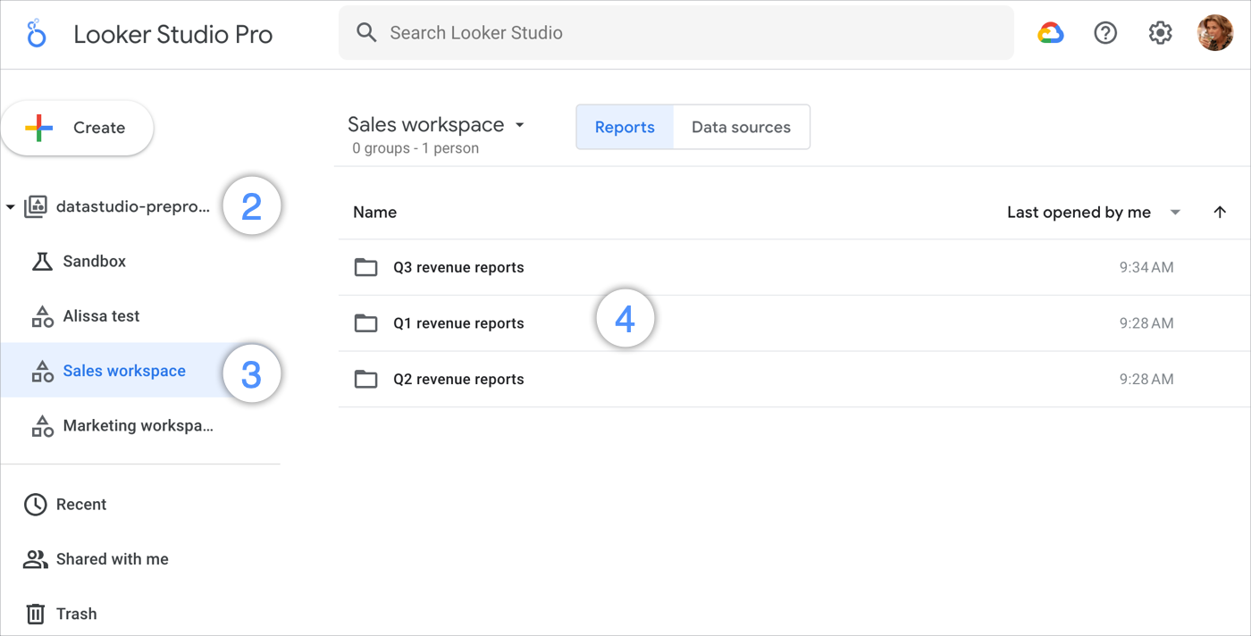
Looker Studio integrates with Google everything. Sheets, Analytics, BigQuery. The UI is clean. Real-time editing technically exists.
But the version control is elementary. Accidental overwrites are a Tuesday. Five data source maximum feels like an arbitrary punishment. API quotas disrupt live reporting at exactly the wrong moment. Performance crumbles under anything complex.
Bottom line: You get basic commenting and sharing. What you don't get is actual iterative, conversational collaboration. Stakeholders are still outside the process, waiting for updates.
Pros:
- Cloud-first, integrates well with Google ecosystem.
- Decent for dashboards, reporting, and data blending.
- Intuitive UI for Google users.
- Option for embedded analytics.
Cons:
- Limits on collaboration: Rigid permissions, elementary version control; accidental overwrites are common, minimal audit trail.
- Data blending and connector capacity (five sources max) is restrictive for advanced, multi-data workflows.
- API quotas can disrupt live collaborative reporting, especially with Google Analytics 4.
- Real-time editing is present, but lacks the features teams expect in modern collaborative platforms.
- Performance issues with large or complex datasets.
Summary: Looker Studio enables basic team commenting and sharing but hampers real-time, iterative collaboration and versioning, making stakeholder workflows transactional rather than conversational.
6. Domo
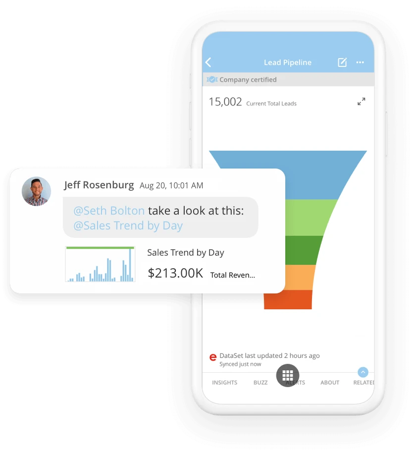
Domo connects to everything, lives entirely in the cloud, and works well for business users who don't want to learn SQL. Great for dashboards. Less great for... basically everything else.
No real co-editing. No semantic modeling worth mentioning. Version control is an afterthought. As teams grow, data sprawl becomes data chaos. Everyone's building their own version of "monthly revenue" because there's no shared truth.
Also, pricing is intentionally opaque and escalates faster than your AWS bill.
Summary: Domo publishes dashboards to viewers. Building something together? That's not really the point.
Pros:
- All-cloud, with connectors for hundreds of sources.
- Easy dashboard embedding and mobile analytics.
- Good for business-oriented, non-technical users.
- Automated dataflow for snapshots.
Cons:
- Minimal multi-user collaboration: No true co-editing, semantic modeling, or version control. Teams often bump into data sprawl and confusion.
- Pricing is complex, opaque, and escalates quickly for broader use.
- Custom analytics and advanced modeling are limited (compared to Tableau, Looker).
- Learning curve for advanced workflows—“easy to start, hard to master.”
Summary: Domo’s workflow favors publishing results to viewers, not rapid, conversational feedback loops, and the technical sprawl contributes to confusion in larger teams.
7. Sisense
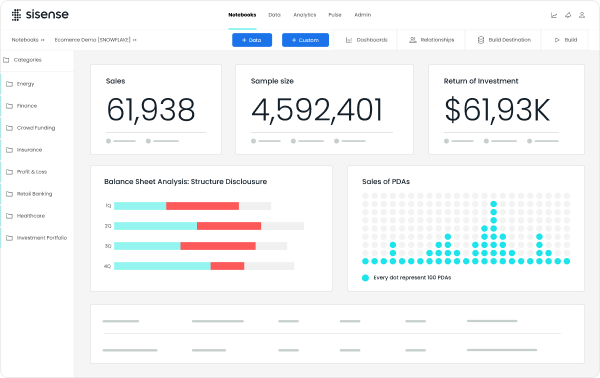
Sisense excels at embedded dashboards—analytics inside your product for customers. Internal collaboration? That's someone else's use case. Versioning is troublesome. Bugs persist. Performance degrades with complexity. Support is slow. Pricing requires a sales call and possibly a therapist. The workflow is transactional: build, embed, troubleshoot, repeat. If you want iterative teamwork, look elsewhere.
Pros:
- Strong for embedded dashboards and visualization.
- Handles numerous integrations and connectors.
- Useful for embedded customer reporting needs.
- Flexible deployment options.
Cons:
- Collaboration is transactional: Embedded analytics is primary; real-time team collaboration limited. Troublesome versioning and persistent bugs.
- Slow performance with complex queries or large datasets.
- Support can be slow; documentation often unclear.
- Pricing is high; opaque for enterprise use behind sales calls.
Summary: Sisense is better suited for “push” dashboards and embedded experiences than for conversational, iterative teamwork. Individual troubleshooting and incident resolution are the norm.
8. SAP BusinessObjects
SAP BusinessObjects is built compliance, security, and formal reporting. It’s a real party animal/ excellent at scheduled PDF generation. It’s terrible at letting stakeholders participate in analysis.
Comments are limited or nonexistent. Version control is obscure. Real-time editing doesn't exist. Technical users build reports, publish them, and everyone else receives them like homework assignments.
If you see collaboration as "controlled dissemination," not "working together.", well…you’ll still hate it.
Pros:
- Powerful enterprise reporting, security, and audit features.
- Robust scheduling, data integration, and metadata management.
- Good for standardized, regulatory reporting.
Cons:
- Poor collaborative UX: Commenting is limited; only accessible in certain modes and cells, version control is obscure, real-time editing is unavailable.
- High complexity and cost of training and upgrades.
- Advanced collaborative features require administrative setup and may be inaccessible to standard users.
- Scheduling/report distribution is rigid—little feedback or iteration support.
Summary: SAP BusinessObjects remains focused on formal, static reporting over collaborative data exploration. Stakeholders are “recipients,” rarely engaged in iterative process.
9. IBM Cognos Analytics
Cognos is excellent at what it was designed for: static reporting, security, compliance, and handling large datasets without breaking. If you need forecasting, complex analytics, and ironclad audit trails, Cognos delivers.
If you want normal humans to explore data together? Wrong tool entirely.
The collaboration model is restrictive by architecture. Technical users build. Non-technical users... look at what was built. Then they request changes via ticket. The learning curve is steep. The dependency on IT and administrators is absolute.
Dashboards are basic. Interactive sharing is limited. Advanced visuals? Not really the point here. Performance degrades at scale. Mobile and web interfaces feel like they're running on a server from 2012.
Implementation is slow. Time to value is measured in quarters, not weeks. And the pricing reflects the fact that Cognos assumes you're a massive enterprise with massive budgets and massive patience.
Reality check: You're not working together—you're waiting in line for IT to build what you need.
Pros:
- Good for static reporting, security, and compliance.
- Supports complex analytics, forecasting, and large datasets.
- Integrates with various databases and data sources.
- Strong historical enterprise brand.
Cons:
- Restrictive collaboration: Technical users must build, publish, and train others; non-technical engagement is limited.
- Steep learning curve, high dependency on IT/administrators.
- Basic dashboards, limited advanced visuals or interactive sharing.
- Performance decreases with scale; slow mobile and web interfaces.
- Expensive and slow to implement—prolonged time to value.
Summary: Cognos emphasizes scheduled, controlled report dissemination—collaboration is inherently bottlenecked by technical workflows and permissions.
10. Yellowfin BI
Yellowfin markets itself on narrative-driven analytics. The pitch is compelling: turn data into stories, make insights accessible to executives, foster collaboration through integrated commenting and sharing.
In practice? You get some of that. Just not the parts that matter most.The visualization engine is solid. Mobile access works well. The storytelling features—where you build sequential, narrative reports—are legitimately useful for executive communications. If your CEO wants a data-driven story about quarterly performance, Yellowfin can deliver that better than most tools.
Pros:
- Strong visualization, storytelling, and mobile access.
- Narrative-driven reports are well-suited for executive communications.
- Integrated collaboration tools: comments, subscriptions, sharing.
Cons:
- Setup complexity: Initial deployment and integration can be lengthy; technical expertise is needed.
- Learning curve for advanced analytics features and collaboration configuration.
- Issues with multi-level data drill-down beyond basic summaries.
- Limited platform support, higher pricing for advanced tiers, support options are restricted.
Summary: Yellowfin fosters basic analysis sharing, but advanced, simultaneous teamwork or iterative workflows are limited by setup complexity and technical barriers.
Getting started with Count
If you’re ready to work together and make data bigger than your data team, here is how you can get started with Count:
- Sign up for a 14-day free trial. You can connect your database and start working immediately with your own data. Or drop in CSVs - we’ve seen our share of Power BI exports.
- Make your first canvas. It’s tempting, but try not to 1:1 duplicate something you already do. Take a look at our examples to get a feel for how you can get more from the canvas.
- Share with stakeholders. You can other analysts to join you, or share the canvas or custom reports securely with a few clicks. We make it easy to make an impact even with a single analyst seat.
- Take a look at our learning materials to explore what Count can do. We’ve also pulled together the experience of dozens of customers who got value quickly from their trial.
- Drop us a message if you want help! We try not to bother people during trials: no sales person will call, our pricing is transparent, and we don’t lock away features, but we’d love to chat if you want to extend your trial into a more formal proof-of-concept (PoC) process.