The only place you'll do analysis
Stop switching between IDEs, notebooks, BI tools, and—sigh—email—to get to the answer and impact. Soup to nuts, answers to what-ifs and buts. All in Count.


“Count solves the disconnect between analysis and decision making - I can explore data, write SQL, explain logic, and share insights all in one place with no need for dashboards, slides, or switching tools to do so. It's also way more flexible than traditional BI tools, so I can build everything from quick explorations to reusable data products. This, along with the canvas environment has helped me work a lot faster, collaborate better, and create more embedded value from my work.”
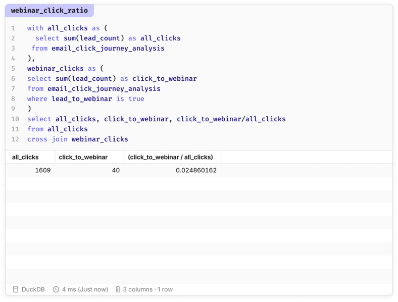
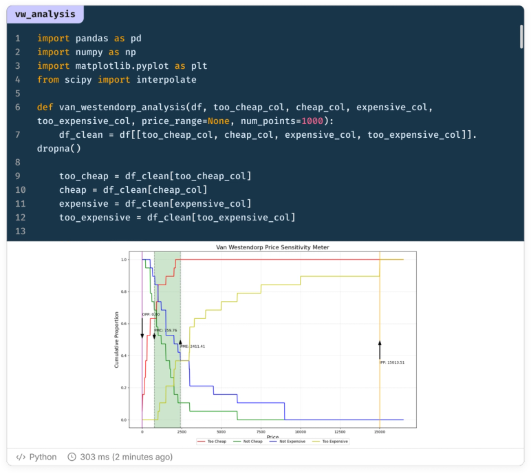
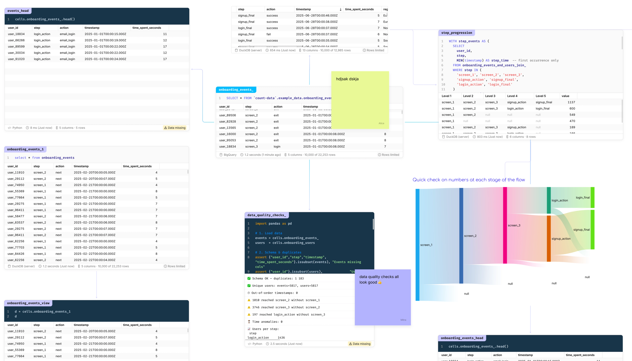
SQL and Python hand-in-hand
Everything you need for every analysis all in a single tool. Pass query results back and forth between cells and join tables regardless of their source.
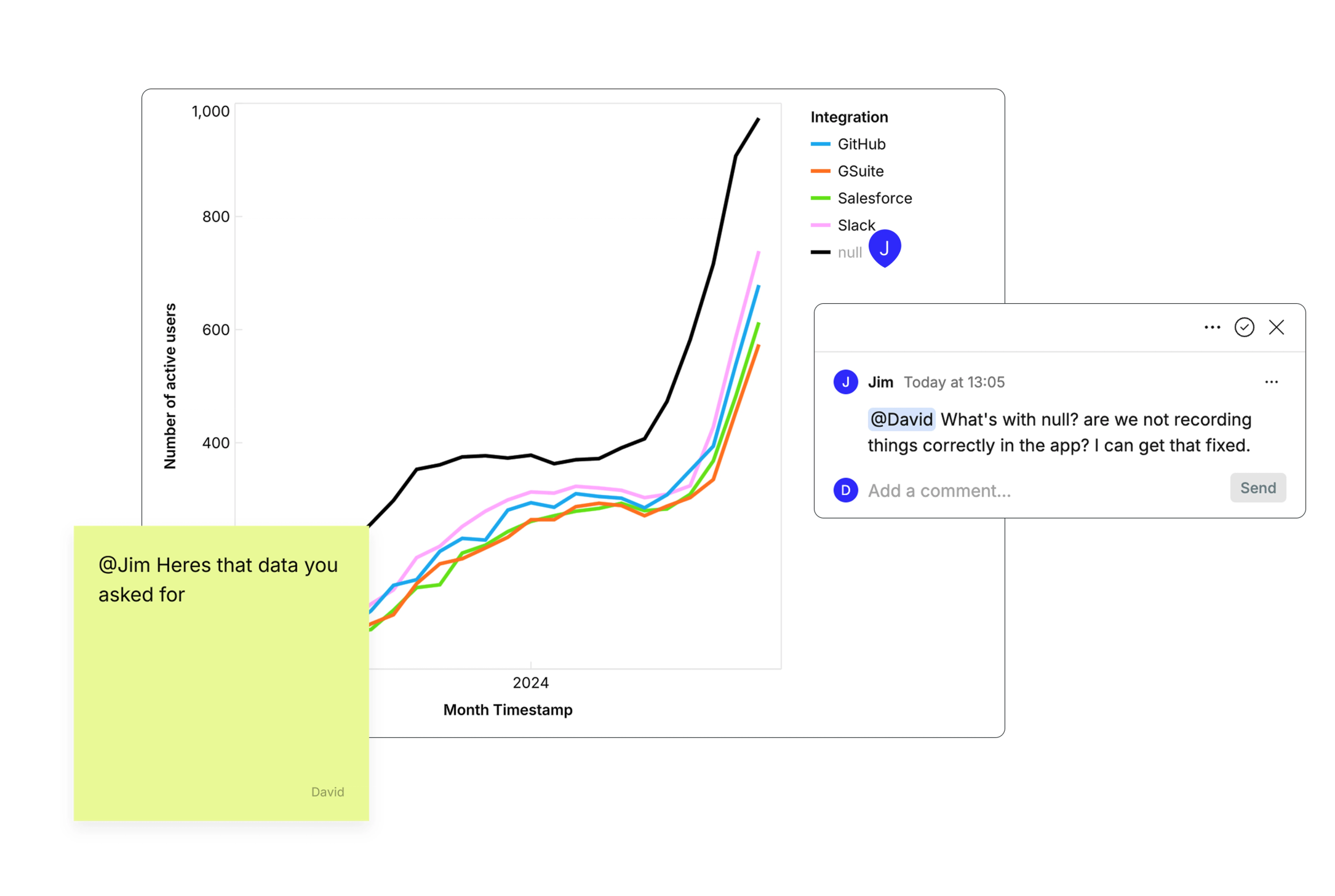
Business and data hand-in-hand
Everything you need for collaborative analysis all in a single workspace. Share context back and forth between stakeholders and analysts, connecting business goals with data insights regardless of whose idea it was. (See what we did there)
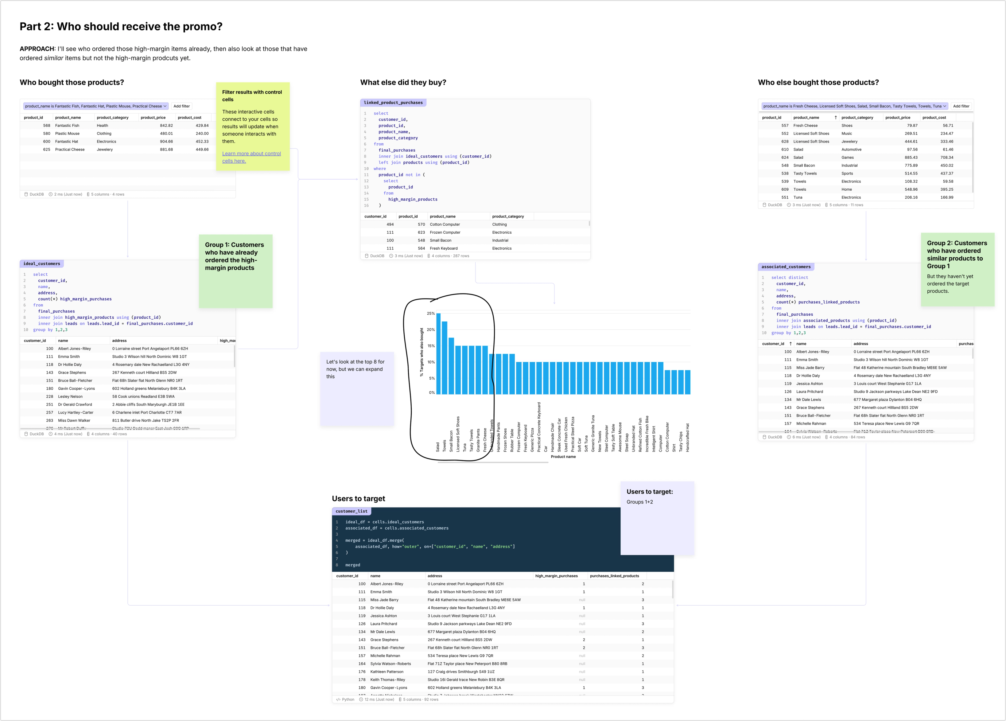
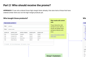
Flexibility, thy name is Canvas
Even the most complex analysis can be made clear. The infinite canvas lets you follow the story, not just the data. Bring images, text, and annotations alongside code and visualizations to complete the picture.
And everything your data tool will never do
~80% of queries running in the browser
Use sliders and controls to turn analysis into models for stakeholders to explore
Shared styles to bring quick consistency to canvases and reports
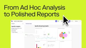
Reports and presentations built from your canvas
A truly multiplayer, collaborative approach to data
Complete flexibility to make data clear
Related Resources
Frequently Asked Questions
Canvases are a better superset of both of those dated approaches. You can work freely with cells as you would in a notebook, but unrestricted by layout: branch off to explore and validate, and move freely between SQL, Python and low-code tables and visualizations.
When it's time to share out, you can either just share the canvas as is, or compose report/presentation views by defining frames. If you really want a dashboard, well, it'll be the nicest dashboarding experience you've ever had.
Canvases are the best all-in-one data exploration environment. But, they are also just as powerful as collaboration tools you may have used like Miro and Mural with images, embeds, sticky notes and conversation.
In Count, the difference is that you can jump straight from organizing notes to validating ideas with live data. Many of our customers run meetings from the canvas, whether monitoring OKRs, or reviewing marketing attribution, canvases are the most collaborative way to bring data into your work.
The prices above include a set number of editor and collaborator seats. Seats can be assigned and used with a more fine-grained permission system:
Editors:
Analysts have full edit permissions in the canvas, including writing SQL and Python code.
Explorers have full edit permissions in the canvas but can only explore data using low code and visual cells.
Collaborators:
Members can edit objects in the canvas but cannot edit the inputs of cells.
Viewers cannot edit objects in the canvas but can add comments and use filters.
Report viewers can only view the presentation layer of the canvas, not the canvas itself (only available in Scale and Enterprise plans).
Firstly, Count supports all the traditional BI workflows you might be familiar with. You can have reports and data sent via email or Slack on a schedule or when a trigger occurs like a value exceeding a defined threshold.
Where Count is different however, is in its ability to bring metrics to life and put them in the context of business operations, processes, and improvement cycles. Stakeholders can see entire business functions or systems on canvases, dive into elements of interest with no-code analysis tools, and collaborate asynchronously with discussion threads and sticky notes, or in real time.
Count helps analysts and wider data teams get out of the cycle of fielding ad-hoc requests and building dashboards and into impactful collaboration around their data.