Product Feature Usage Map
Map your product features into a hierarchical format to explore usage and pinpoint opportunities to improve usability and adoption.
- Product analytics
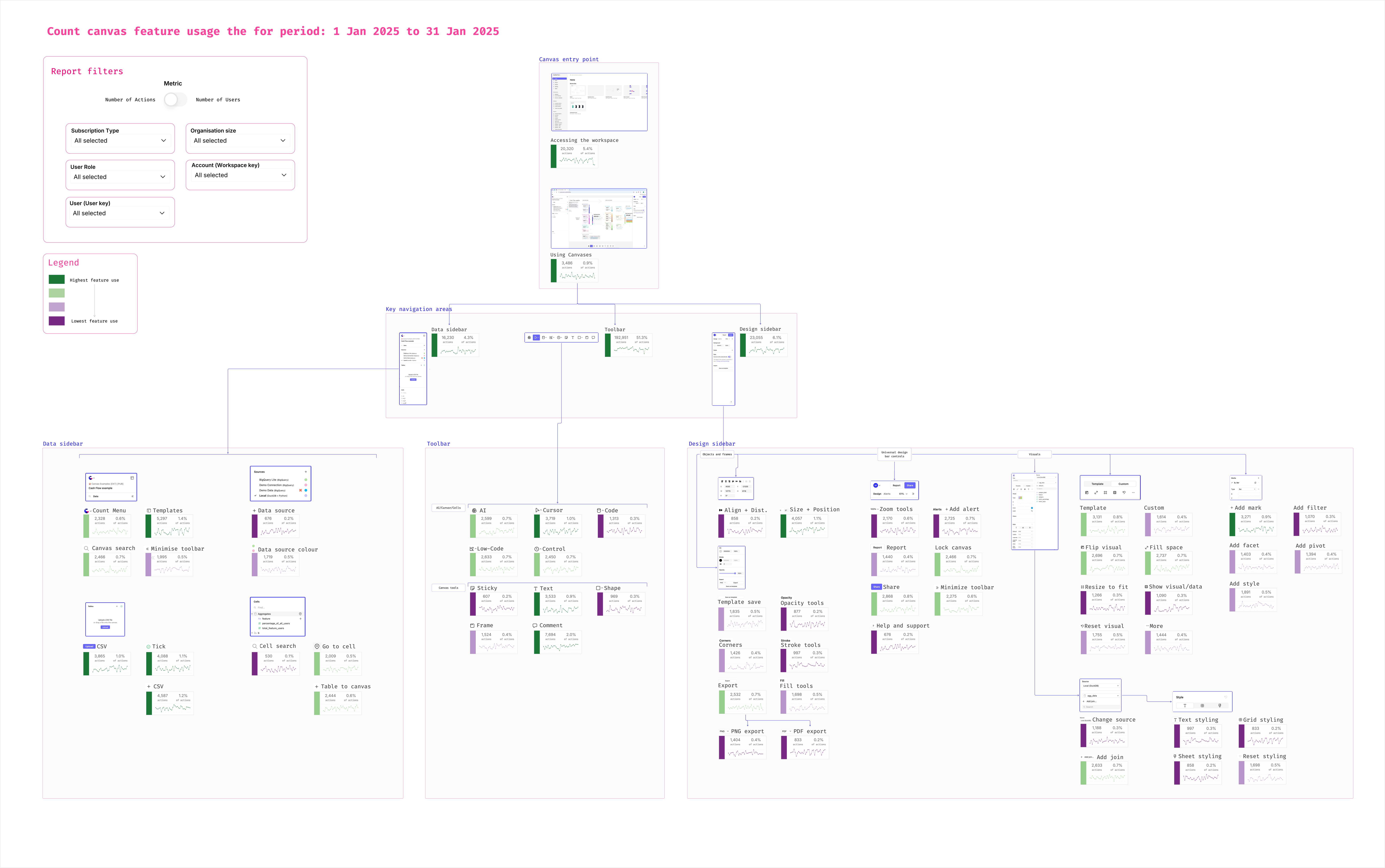
Canvas details
Problem: Product usage data is stuck in rigid dashboards and fragmented across tools with no clear overarching view.
Solution: Map product features into a canvas in a logical order with clear visuals, screenshots, metrics, and drill-down filters.
Impact: Understand feature popularity for different filter segments and pinpoint opportunities to improve usability and adoption.
Similar examples
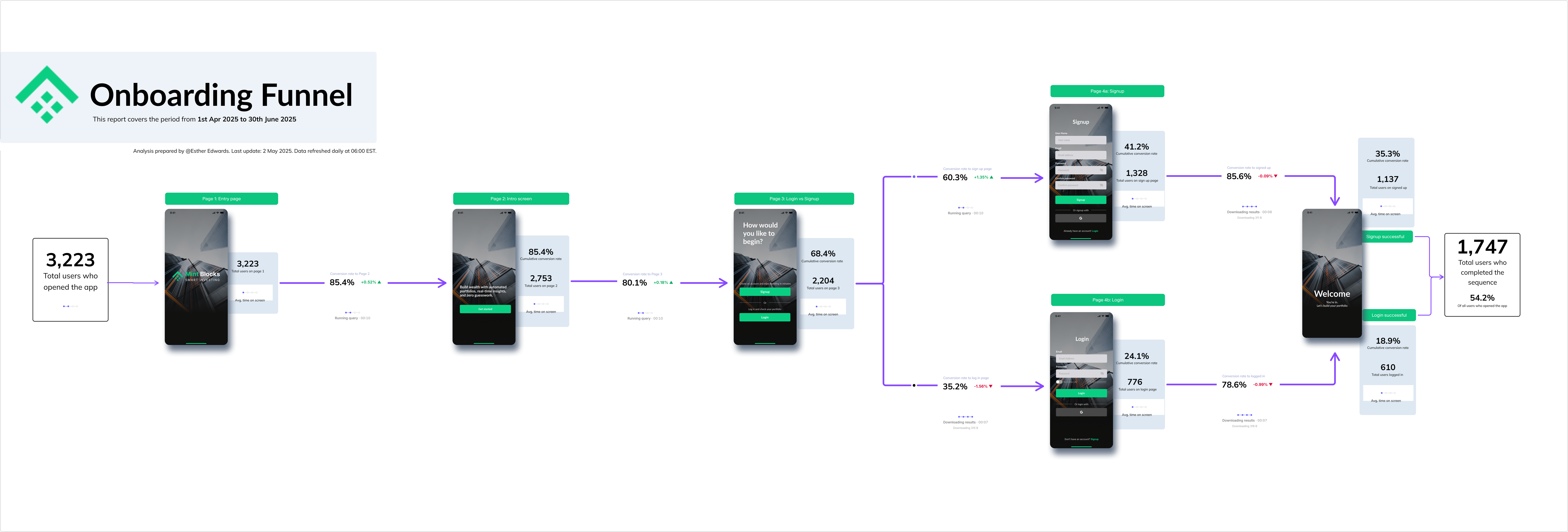
Simple Onboarding Funnel
Visual onboarding funnels with live data, screenshots, and drop-off insights so product teams instantly see what’s breaking activation and where to fix for more revenue.
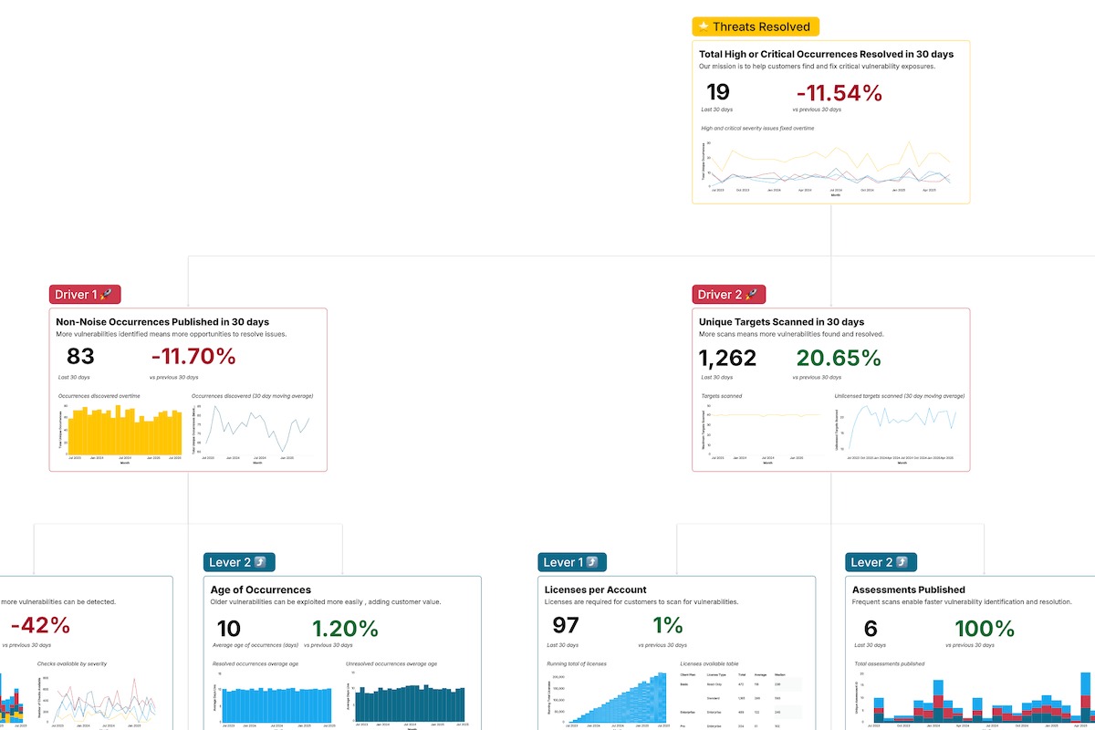
Intruder's Product Metrics Map
See how Intruder mapped product metrics to a North Star, aligning usage, customer value, and business growth in one clear, actionable view.