Explore Priority Distribution Analysis using your Jira data
Priority Distribution Analysis with Jira Data
Priority Distribution Analysis reveals how your team assigns priority levels across Jira tickets, exposing critical patterns that impact project delivery and resource allocation. Jira's rich priority data—from Blocker to Trivial—combined with assignee information, sprint assignments, and issue types, provides the foundation for understanding whether your team suffers from priority inflation where everything becomes "urgent."
This analysis helps engineering managers identify how to fix priority inflation by revealing when too many tickets receive high priority designations, making it impossible to focus on truly critical work. You can spot trends like why are all tickets high priority by examining priority distribution across teams, sprints, or issue types, enabling data-driven conversations about realistic priority setting.
Calculating this manually through spreadsheets means wrestling with countless permutations—priority by assignee, by epic, by time period—while risking formula errors that skew results. Maintaining these calculations as new tickets flow in becomes a full-time job. Jira's native reporting tools offer basic priority breakdowns but can't segment by custom fields, compare priority trends across teams, or help you drill into specific patterns causing priority creep.
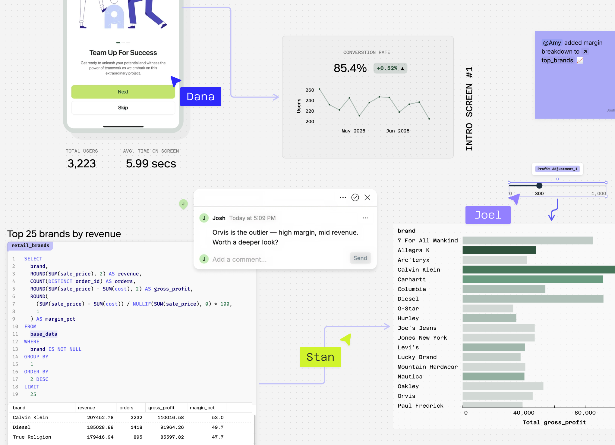
Count transforms your Jira priority data into actionable insights, automatically tracking priority distribution changes over time and highlighting when priority inflation threatens your team's focus and productivity.
Turn Your Jira Priority Data Into Decisions
Stop reading about priority analysis—actually do it. Connect your Jira data to Count's AI-powered canvas and uncover patterns with your team in one session.
Questions You Can Answer
What percentage of our Jira tickets are marked as high or critical priority? This reveals the scope of priority inflation in your backlog and helps identify if your team is overusing urgent priority levels, making it difficult to focus on truly critical work.
Why are all tickets high priority in our current sprint? Understanding sprint-level priority distribution exposes whether your team struggles with proper prioritization during sprint planning, potentially leading to burnout and missed deadlines.
How has our priority distribution changed across different Jira projects over the last 6 months? This analysis uncovers trends in priority assignment patterns by project, helping identify which teams or project types are most prone to priority creep and need intervention.
Which issue types (Story, Bug, Task, Epic) have the highest percentage of critical priority assignments? Segmenting priority inflation by issue type reveals whether certain work categories are systematically over-prioritized, allowing for more targeted priority management strategies.
How does priority distribution vary between tickets created by different reporters or assigned to different teams? This cross-cutting analysis identifies specific users or teams who consistently inflate priorities, enabling targeted coaching on how to fix priority inflation and establish better prioritization practices across your organization.
How Count Does This
Count's AI agent crafts bespoke SQL queries tailored to your specific Jira priority questions — whether you're investigating why are all tickets high priority or analyzing priority trends across specific projects. Rather than using rigid templates, Count writes custom logic to examine your exact priority distribution patterns.
Within seconds, Count runs hundreds of queries across your Jira data to uncover hidden insights about how to fix priority inflation. It automatically identifies priority creep patterns, analyzes assignment behaviors by team members, and correlates priority levels with actual resolution times — revealing discrepancies between stated urgency and real delivery patterns.
Count handles the messy reality of Jira data, automatically cleaning inconsistent priority labels, handling custom priority schemes, and normalizing data across different projects. Its transparent methodology shows you exactly how it calculated priority percentages, identified outliers, and determined statistical significance of trends.
The analysis transforms into presentation-ready reports showing priority distribution heat maps, trend analysis over time, and actionable recommendations for priority governance. Your team can collaboratively explore the results, drilling into specific projects or time periods where priority inflation is most severe.
Count connects your Jira priority data with other sources — customer support tickets, revenue data, or deployment metrics — to validate whether high-priority assignments align with actual business impact, providing the complete context needed to fix priority inflation systematically.
Explore related metrics
Turn Your Jira Priority Data Into Decisions
Stop reading about priority analysis—actually do it. Connect your Jira data to Count's AI-powered canvas and uncover patterns with your team in one session.