Explore Dashboard Utilization Rate using your Monday.com data
Dashboard Utilization Rate in Monday.com
Dashboard Utilization Rate measures how actively your team engages with Monday.com dashboards, revealing whether your carefully crafted project views and data visualizations are actually driving decision-making. For Monday.com users, this metric is particularly valuable because the platform captures rich behavioral data—from board views and widget interactions to filter usage and dashboard sharing patterns. Understanding why dashboard utilization rate is low helps you identify whether teams are missing critical project insights, while knowing how to improve dashboard utilization rate ensures your Monday.com investment translates into better collaboration and visibility.
Analyzing dashboard engagement manually quickly becomes overwhelming. Spreadsheets require you to export usage data, cross-reference it with user roles and project timelines, then maintain complex formulas across multiple workbooks—a process prone to errors and impossible to scale as your Monday.com workspace grows. Monday.com's built-in analytics provide basic usage statistics but can't segment data by team dynamics, project complexity, or seasonal patterns. They also can't answer nuanced questions like "Which dashboard elements correlate with project success?" or "How does utilization vary between different workspace types?"
Count transforms your Monday.com usage data into actionable insights, automatically tracking engagement patterns and identifying optimization opportunities without the manual complexity.
Stop Reading About Dashboard Metrics, Start Analyzing Them
Connect your Monday.com data to Count's AI-powered canvas. Go from dashboard utilization questions to actionable insights in one collaborative session.
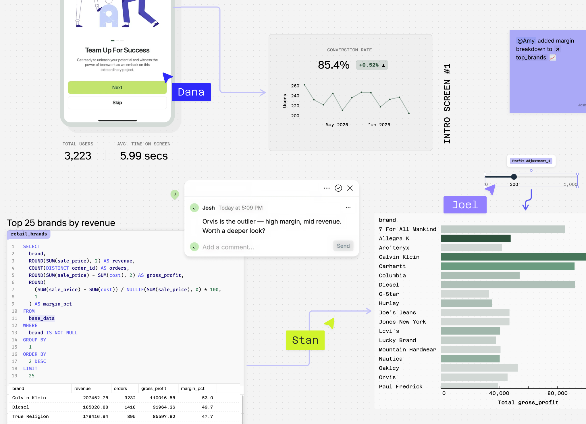
Questions You Can Answer
What's my overall dashboard utilization rate in Monday.com? This gives you a baseline understanding of how frequently your team accesses dashboards across all workspaces, helping identify if low engagement is a widespread issue.
Which Monday.com workspaces have the lowest dashboard utilization rates? Reveals specific areas where teams aren't leveraging visual data insights, allowing you to focus improvement efforts on underperforming workspaces.
How does dashboard utilization rate vary by team role or user permissions in Monday.com? Uncovers whether certain user types (admins, members, viewers) engage differently with dashboards, helping you understand why dashboard utilization rate is low among specific groups.
What's the correlation between board activity and dashboard views in my Monday.com account? Shows whether teams actively updating boards are also consuming dashboard insights, revealing potential gaps in the data-to-decision workflow.
How does dashboard utilization rate change during different project phases or status updates in Monday.com? Identifies when teams most need visual insights during project lifecycles, helping you understand usage patterns and optimize dashboard placement.
Which Monday.com dashboard widgets get the most engagement, and how does this impact overall utilization rates across different item types? Provides granular insights into which visualizations drive value, enabling you to replicate successful dashboard designs and improve dashboard utilization rate systematically.
How Count Analyses Dashboard Utilization Rate
Count's AI agent creates bespoke analysis for your Monday.com Dashboard Utilization Rate, writing custom SQL and Python logic tailored to your specific questions about why dashboard utilization rate is low or how to improve dashboard utilization rate. Rather than using rigid templates, Count crafts unique queries that might segment your Monday.com usage data by team role, workspace type, dashboard complexity, and time patterns in a single comprehensive analysis.
The platform runs hundreds of queries in seconds, uncovering hidden patterns in your Monday.com activity logs that manual analysis would miss—like discovering that certain dashboard layouts correlate with higher engagement rates, or identifying specific times when usage drops dramatically. Count automatically handles messy Monday.com data, cleaning away incomplete session records, duplicate entries, and inconsistent user tracking that commonly plague usage analytics.
Every analysis includes transparent methodology, showing exactly how Count calculated utilization rates, what assumptions it made about active vs. passive usage, and how it handled edge cases in your Monday.com data. The results come presentation-ready, transforming your raw question into deep insights about dashboard adoption barriers, user behavior patterns, and actionable improvement strategies.
Count's collaborative environment lets your team explore follow-up questions together—diving deeper into why specific dashboards underperform or testing hypotheses about usage improvements. The platform also connects your Monday.com data with other sources like user feedback systems or training completion records, providing holistic insights into what drives effective dashboard adoption across your organization.
Explore related metrics
Stop Reading About Dashboard Metrics, Start Analyzing Them
Connect your Monday.com data to Count's AI-powered canvas. Go from dashboard utilization questions to actionable insights in one collaborative session.