Feature Flag Impact Analysis
Feature flag impact analysis measures how feature releases affect key business metrics like conversion rates, user engagement, and revenue, enabling data-driven decisions about rollouts and rollbacks. Most teams struggle with determining whether their feature flags are actually improving performance, lack visibility into negative impacts, and don't know how to optimize their rollout strategies for maximum business value.
What is Feature Flag Impact Analysis?
Feature Flag Impact Analysis is the systematic evaluation of how feature flags affect key business metrics and user behavior throughout their lifecycle. This analysis involves measuring the performance difference between users who experience the new feature versus those who don't, tracking metrics like conversion rates, user engagement, and retention to understand the true impact of feature changes. Organizations use this analysis to make data-driven decisions about whether to fully roll out, modify, or roll back features based on their actual performance rather than assumptions.
Understanding how to analyze feature flag impact is crucial because it directly informs product development strategies and resource allocation decisions. When feature flag impact analysis shows positive results—such as increased conversion rates, higher user engagement, or improved retention—it signals that the feature adds value and should be expanded to more users. Conversely, negative impact analysis results may indicate the need for feature modifications or complete rollbacks to prevent harm to core business metrics.
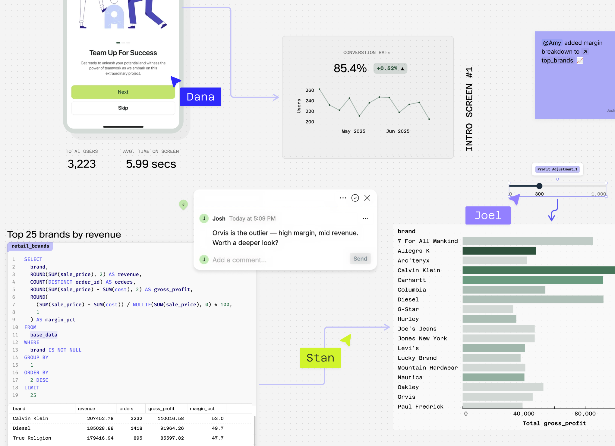
Feature flag impact analysis is closely interconnected with A/B Testing Analysis, Conversion Rate tracking, and Feature Adoption Rate measurement. A comprehensive feature flag a/b test analysis template typically examines these metrics together, as changes in feature adoption directly influence conversion performance and overall user experience outcomes.
How to do Feature Flag Impact Analysis?
Feature Flag Impact Analysis requires a structured approach to isolate the true impact of your feature changes from other variables affecting user behavior.
Approach: Step 1: Establish baseline metrics by measuring key performance indicators before flag deployment Step 2: Segment users into control (flag off) and treatment (flag on) groups with proper randomization Step 3: Track behavioral changes across multiple time periods to account for novelty effects and long-term adoption patterns
The analysis combines pre/post comparisons with controlled experimentation, measuring both immediate reactions and sustained behavioral shifts. You'll need user-level data showing flag exposure, timestamps, and relevant conversion events across your customer journey.
Worked Example
Consider analyzing a new checkout flow feature flag. Your baseline shows a 12% conversion rate with 10,000 weekly users. After deploying the flag to 50% of users:
- Control group (5,000 users): 11.8% conversion rate (590 conversions)
- Treatment group (5,000 users): 14.2% conversion rate (710 conversions)
The relative lift is 20.3% ((14.2-11.8)/11.8), but you also examine secondary metrics: average order value increased 8% while cart abandonment decreased 15%. Time-series analysis reveals the effect stabilized after day 3, suggesting genuine behavioral change rather than novelty bias.
Variants
Cohort-based analysis tracks users from their first flag exposure through multiple sessions, ideal for measuring long-term retention impacts. Segmented analysis breaks results by user characteristics (new vs. returning, device type, geography) to identify where flags perform best. Sequential analysis monitors results continuously, allowing early stopping for significant effects or concerning negative trends.
Common Mistakes
Insufficient statistical power leads to false conclusions—ensure adequate sample sizes before drawing insights. Many teams run analysis too early, missing delayed effects or mistaking temporary novelty for sustained improvement. Ignoring Simpson's Paradox where overall positive results mask negative effects in important user segments, particularly when flag exposure isn't properly randomized across different user types.
Stop guessing if your feature flags actually work
Connect your data warehouse and let AI build the analysis while your team watches. See real impact on conversion and revenue in one collaborative canvas.
What makes a good Feature Flag Impact Analysis?
While it's natural to want benchmarks for feature flag performance, context matters significantly more than absolute numbers. These benchmarks should guide your thinking and help you spot outliers, not serve as rigid targets to hit at all costs.
Feature Flag Success Rate Benchmarks
| Industry | Company Stage | Business Model | Success Rate | Rollback Rate | Time to Full Rollout |
|---|---|---|---|---|---|
| SaaS | Early-stage | B2B Self-serve | 65-75% | 15-25% | 2-4 weeks |
| SaaS | Growth | B2B Enterprise | 70-80% | 10-20% | 4-8 weeks |
| SaaS | Mature | B2B Enterprise | 75-85% | 8-15% | 6-12 weeks |
| Ecommerce | Early-stage | B2C | 60-70% | 20-30% | 1-3 weeks |
| Ecommerce | Growth/Mature | B2C | 70-80% | 15-25% | 2-6 weeks |
| Fintech | All stages | B2B/B2C | 80-90% | 5-12% | 8-16 weeks |
| Media/Content | Subscription | B2C | 65-75% | 18-28% | 3-8 weeks |
Industry estimates based on feature flag rollout best practices and reported success rates
Understanding Context Over Numbers
These benchmarks help inform your general sense of performance—you'll know when something seems significantly off. However, feature flag metrics exist in tension with each other. As your feature flag success rate benchmark improves, you might see longer rollout times or more conservative rollback decisions. Similarly, aggressive rollout timelines often correlate with higher rollback rates but faster learning cycles.
The key is considering related metrics holistically rather than optimizing any single metric in isolation. Your average feature flag adoption rate should align with your risk tolerance, user base characteristics, and business priorities.
How Related Metrics Interact
Consider a SaaS company improving their feature flag rollout best practices by implementing more rigorous testing. Their success rate might increase from 65% to 80%, but their average time to full rollout could extend from 3 weeks to 6 weeks. This trade-off might be worthwhile if failed features previously caused significant customer churn or support burden.
Conversely, a fast-moving startup might accept a 60% success rate and 25% rollback rate to maintain rapid iteration cycles, especially if their user base tolerates experimental features and quick reversions don't significantly impact retention or satisfaction.
Why are my feature flags hurting metrics?
When feature flags are negatively impacting your key metrics, several common culprits are usually at play. Here's how to diagnose what's going wrong:
Insufficient baseline measurement You're seeing metric drops but can't pinpoint the cause because you didn't establish proper pre-rollout baselines. Look for sudden metric changes that coincide with flag deployments, but lack historical context for comparison. Without baseline data, every fluctuation becomes a false alarm, making it impossible to separate feature impact from natural variance.
Poor user segmentation in rollouts Your feature flag impact on conversion rate varies wildly across different user groups because you're not segmenting properly. Signs include some cohorts showing positive results while others tank, or geographic/demographic patterns in performance. This often cascades into skewed overall metrics that don't reflect true feature performance.
Technical implementation issues Feature flags are causing performance degradation or user experience problems. Watch for increased page load times, higher error rates, or user complaints coinciding with flag activations. These technical issues compound into broader metric deterioration as user satisfaction drops and engagement plummets.
Inadequate sample sizes and testing duration You're making rollback decisions on incomplete data, leading to premature conclusions about why feature flags are hurting metrics. Look for high variance in results, conflicting day-to-day performance, or results that flip frequently. Small samples create noise that masks true feature impact.
Conflicting concurrent changes Multiple features or marketing campaigns are running simultaneously, creating attribution confusion. Your metrics show decline, but you can't isolate which changes are responsible. This leads to incorrect rollback decisions and missed optimization opportunities.
Each of these issues requires systematic investigation to improve feature flag performance and restore metric health.
How to improve feature flag performance
Establish robust baseline measurement before rollout Before enabling any feature flag, capture comprehensive baseline metrics across all relevant dimensions. Set up automated tracking for your key metrics 2-4 weeks prior to launch, segmented by user cohorts, traffic sources, and behavioral patterns. This prevents the "insufficient baseline" problem by giving you clean comparison data. Validate your baseline is stable by confirming metrics aren't trending up or down before launch.
Implement progressive rollout with monitoring checkpoints Roll out feature flags gradually (5% → 25% → 50% → 100%) with mandatory metric reviews at each stage. Set automated alerts for significant deviations in conversion rates, engagement, or other key metrics. This catches negative impacts early when they're easier to address. Use cohort analysis to compare performance between flag-enabled and control groups at each rollout percentage.
Isolate feature impact through proper segmentation Separate your feature flag impact from external factors by analyzing performance across different user segments, time periods, and traffic sources. If your feature flag impact on conversion rate looks negative overall, drill down into new vs. returning users, different acquisition channels, or device types. Often, the feature works well for specific segments while hurting others.
Run controlled experiments to validate fixes When you identify performance issues, don't guess at solutions. Create A/B tests comparing your current implementation against modified versions. Test different UX approaches, timing, or targeting criteria. Use statistical significance testing to ensure observed improvements aren't due to random variation. This systematic approach helps you understand exactly what changes drive better feature flag performance.
Analyze user journey impact beyond primary metrics Look beyond your main KPIs to understand how feature flags affect the entire user experience. A feature might improve conversion rates but hurt retention, or boost engagement but increase support tickets. Map the complete user journey to identify these trade-offs early.
Run your Feature Flag Impact Analysis instantly
Stop calculating Feature Flag Impact Analysis in spreadsheets and losing valuable time on manual data crunching. Connect your data source and ask Count to calculate, segment, and diagnose your Feature Flag Impact Analysis in seconds, giving you instant insights into how your feature rollouts are actually performing.
Explore related metrics
A/B Test Performance
Feature flags are often used to implement A/B tests, so tracking A/B test performance helps you understand whether your feature flag changes are driving statistically significant improvements.
Feature Adoption Rate
When analyzing feature flag impact, you need to know what percentage of users are actually experiencing the new feature to properly attribute any metric changes.
Conversion Rate
Feature flags often aim to improve user conversion, so tracking conversion rate helps you measure whether your feature changes are achieving their intended business impact.
User Activation Rate
Feature flags frequently target onboarding improvements, making user activation rate essential for measuring whether your feature changes help new users reach their first value moment.
A/B Testing Analysis
Feature flag rollouts require the same statistical rigor as A/B tests to ensure you're making data-driven decisions about which features to keep, modify, or remove.
Stop guessing if your feature flags actually work
Connect your data warehouse and let AI build the analysis while your team watches. See real impact on conversion and revenue in one collaborative canvas.