Explore Revenue Cohort Analysis using your Stripe data
Revenue Cohort Analysis with Stripe Data
Revenue Cohort Analysis reveals how customer groups generate revenue over time, making it essential for Stripe users who need to understand the long-term value of their subscription base. Stripe's rich transaction data—including subscription events, plan changes, upgrades, downgrades, and churn patterns—provides the perfect foundation for cohort analysis. This analysis helps businesses identify which customer acquisition channels drive the highest lifetime value, when revenue typically peaks or declines, and how product changes impact different customer segments.
However, performing this analysis manually creates significant challenges. Spreadsheets quickly become unwieldy when exploring multiple cohort dimensions—acquisition month, plan type, customer segment, or geographic region. Formula errors are common when calculating retention rates and cumulative revenue across dozens of cohorts, and updating these calculations monthly becomes extremely time-consuming as your customer base grows.
Stripe's built-in reporting tools offer basic cohort views but lack the flexibility needed for deeper analysis. You can't easily segment cohorts by custom attributes, compare different time periods, or drill down into specific revenue patterns. When stakeholders ask follow-up questions about why revenue cohort analysis is declining or how to improve revenue cohort analysis performance, these rigid dashboards can't provide answers.
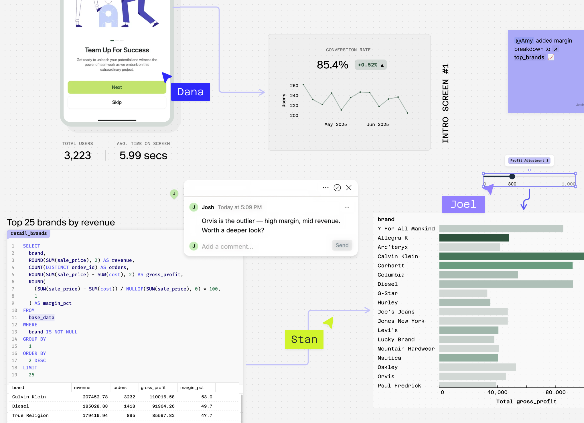
Count eliminates these limitations by automatically calculating cohort metrics from your Stripe data while enabling unlimited segmentation and exploration.
Stop Reading About Cohorts, Start Building Them
Connect your Stripe data and build revenue cohorts in minutes, not weeks. AI analyst + SQL + your team, all in one canvas.
Questions You Can Answer
How much revenue did my January 2024 cohort generate in their first 6 months? This baseline question helps you understand the revenue trajectory of a specific customer group, establishing benchmarks for cohort performance using Stripe's subscription and invoice data.
Why is revenue cohort analysis declining for customers acquired through my marketing campaigns? By analyzing Stripe's customer metadata and acquisition sources, you can identify whether certain marketing channels are bringing in lower-quality customers who generate less revenue over time.
How does revenue cohort performance differ between my monthly and annual subscription plans? This reveals which pricing models drive stronger long-term revenue retention, leveraging Stripe's subscription interval data to optimize your pricing strategy.
What's the revenue cohort analysis for customers who upgraded vs. downgraded their plans in the past quarter? Understanding how plan changes affect cohort revenue helps identify expansion opportunities and churn risks using Stripe's subscription modification history.
How to improve revenue cohort analysis by comparing performance across different customer segments like geography, payment method, and subscription tier? This sophisticated analysis combines Stripe's customer location data, payment method information, and subscription details to reveal which customer segments drive the strongest long-term revenue growth and inform targeted retention strategies.
How Count Does This
Count transforms Revenue Cohort Analysis from a manual, template-driven process into an intelligent, adaptive exploration of your Stripe data. Instead of forcing your analysis into rigid frameworks, Count's AI agent writes custom SQL logic tailored to your specific cohort questions — whether you're tracking monthly recurring revenue patterns, analyzing upgrade behaviors, or investigating why revenue cohort analysis is declining for certain customer segments.
The platform runs hundreds of queries simultaneously across your Stripe data, automatically identifying revenue trends, seasonality patterns, and anomalies that would take weeks to uncover manually. When examining how to improve revenue cohort analysis, Count handles the messy realities of subscription data — duplicate charges, refunds, plan changes, and currency conversions — cleaning these issues automatically while maintaining full transparency about every transformation.
Count's methodology is completely visible, showing exactly how it calculated cohort boundaries, handled subscription modifications, and aggregated revenue across time periods. This transparency is crucial when presenting cohort findings to stakeholders or debugging unexpected revenue patterns.
The collaborative nature means your entire team can dive into cohort results together, asking follow-up questions like "Why did the Q2 cohort underperform?" or "How do enterprise cohorts compare to SMB cohorts?" Count can even connect your Stripe data with other sources — your CRM, marketing platforms, or support tickets — to understand the full context behind cohort performance and identify actionable improvement opportunities.
Explore related metrics
Stop Reading About Cohorts, Start Building Them
Connect your Stripe data and build revenue cohorts in minutes, not weeks. AI analyst + SQL + your team, all in one canvas.