Explore Burndown Analysis using your Asana data
Burndown Analysis with Asana Data
Burndown Analysis transforms your Asana project data into actionable insights by tracking work completion rates against planned timelines. With Asana's rich task data—including story points, due dates, completion timestamps, and sprint assignments—you can visualize whether your team is on track to meet sprint goals and identify bottlenecks before they derail projects. This analysis helps project managers make critical decisions about scope adjustments, resource allocation, and timeline expectations using real project velocity data.
Manual burndown analysis quickly becomes a nightmare. Spreadsheets require complex formulas to aggregate task data across multiple projects, calculate remaining work by sprint day, and handle edge cases like scope changes or moved tasks. With dozens of variables to track and frequent data updates needed, formula errors are inevitable and maintenance becomes overwhelming. Even a simple burndown chart example requires hours of manual data manipulation.
Asana's built-in reporting offers basic progress views but lacks the flexibility for meaningful burndown analysis. You can't easily segment by team members, compare velocity across sprints, or drill down when asking "how to improve burndown analysis" for specific project types. The rigid dashboards can't answer follow-up questions about why burndowns deviate from ideal trajectories or help identify patterns across multiple projects.
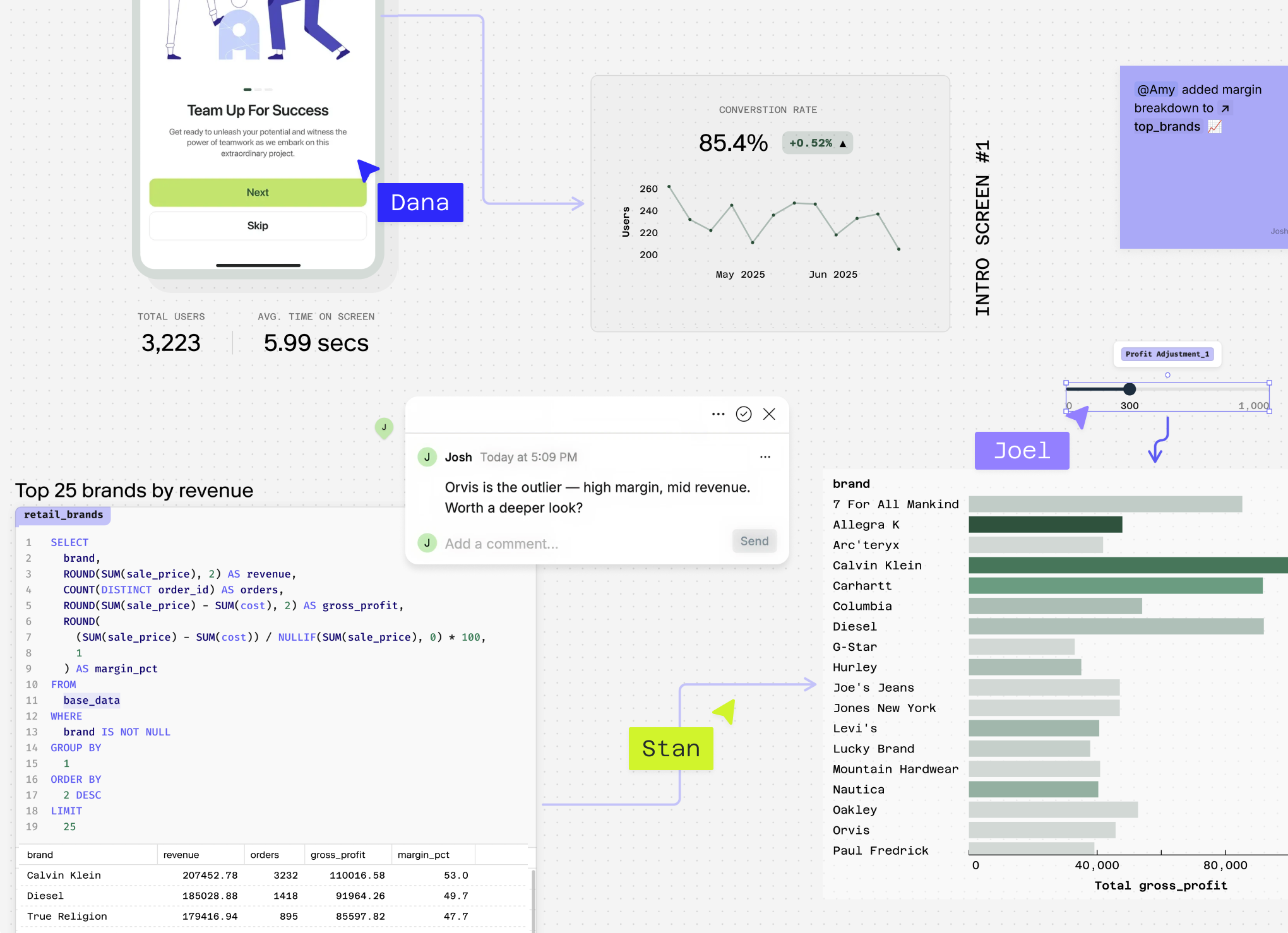
Count automatically connects to your Asana data, generating dynamic burndown visualizations that update in real-time and allow deep exploration of your team's delivery patterns.
Turn your Asana data into actual burndown insights
Reading about burndown analysis won't fix your sprint planning. Connect your Asana data directly to Count's AI analyst and build real burndown charts in minutes, not weeks.
Questions You Can Answer
Show me a burndown chart for my current sprint in Asana This provides a classic burndown chart example using your Asana sprint data, displaying remaining work against your planned timeline to instantly see if you're on track for sprint completion.
Why is my burndown chart going up instead of down for the Marketing Campaign project? This identifies scope creep or task additions mid-sprint by analyzing when new tasks were added to your Asana project, helping you understand deviations from your original burndown trajectory.
How to improve burndown analysis by comparing story points completed versus tasks completed across my Asana teams? This reveals whether your team's estimation accuracy varies by comparing story point velocity against simple task completion rates, highlighting potential estimation issues that could improve future sprint planning.
What's the burndown pattern for high-priority tasks versus normal priority tasks in my Asana projects over the last quarter? This advanced analysis segments your burndown data by Asana's priority levels, showing whether critical work gets completed consistently or if priority tasks tend to slip, enabling better resource allocation strategies.
Create a burndown analysis comparing my development team's velocity in Asana projects that used custom fields versus those without detailed tracking This sophisticated cross-analysis examines how Asana's custom field usage correlates with team performance, providing insights into which project management practices actually improve delivery predictability.
How Count Does This
Count's AI agent creates bespoke burndown analysis tailored to your specific Asana project structure, rather than forcing your data into rigid templates. Whether you're tracking story points, task counts, or custom effort estimates, Count writes custom SQL logic that adapts to exactly how your team works.
When you ask for a burndown chart example, Count runs hundreds of queries in seconds to analyze your Asana data from multiple angles—identifying velocity trends, bottlenecks, and completion patterns that manual analysis would miss. It automatically surfaces insights like which team members consistently complete tasks early or which task types cause timeline delays.
Count handles messy data inherent in project management, automatically cleaning inconsistent due dates, missing story points, and duplicate tasks that commonly plague Asana workspaces. This ensures your burndown analysis reflects accurate progress without manual data preparation.
Every analysis comes with transparent methodology—Count shows exactly how it calculated remaining work, handled incomplete tasks, and projected completion dates, so you can verify the burndown chart's accuracy.
The presentation-ready output transforms raw Asana task data into executive-ready burndown visualizations with actionable recommendations on how to improve burndown analysis. Your team can collaboratively review sprint performance, discuss velocity changes, and plan improvements directly within Count.
Count also enables multi-source analysis, combining your Asana burndown data with Git commits, support tickets, or revenue metrics to understand how development velocity impacts broader business outcomes.
Explore related metrics
Turn your Asana data into actual burndown insights
Reading about burndown analysis won't fix your sprint planning. Connect your Asana data directly to Count's AI analyst and build real burndown charts in minutes, not weeks.