Bye-bye notebooks. Hello, canvas.
Written by The Count Team
Introducing Count Canvas: A collaborative space for analysts and stakeholders to transform data into actionable insights, enhancing creativity and efficiency in the modern data stack.
Today we’re announcing the launch of the Count canvas - a shared space where analysts and stakeholders can truly collaborate with data. If you haven’t seen it already, check out our demo video then grab a cup of coffee and read on as we dig a bit deeper…
Nine months ago the Count team made the hard decision to walk away from our industry-leading¹ SQL notebook and swing for a completely new kind of data tool. We loved our notebook but we didn’t feel it changed the game to the degree we felt was needed.
We started with just a handful of vague ideas, not 100% clear on where we’d end up. All we knew was a big leap forward in data analysis was desperately needed as was a change in the relationship between data teams and the businesses they served.
This is the story of that journey. It covers the background to our decision, the principles in the industry we decided to break, and the exciting changes we’ve seen data teams start to make to help them move faster.
The Modern Data Stack has a last mile problem…
So first let’s set the scene. The data industry in 2022 is in an interesting place. The hype and froth of enthusiasm for the modern data stack (MDS) have peaked. The MDS is now just the way data stacks are built. As an industry, we’re increasingly taking stock and wondering what’s next. Some of us are even getting a bit cynical...
Serious question for all of you who work in#data(and anyone who's data-minded). What do you actually do with data, besides analyze it, and ML/AI? What I'm getting at is–I'm not convinced that analytics leads to outcomes as much as we like to think it does. The whole... (1/2)
— Mary MacCarthy (she/her) (@MaryMacCarthy)
\n\n
There’s no doubt that the modern data stack has been a game changer. Our pipelines and data models are more robust, our data warehouses are blisteringly fast compared to what we had before. There certainly is no going back!
However a problem has started becoming evident… despite all the innovation on the back end of our stack, the front end - where, our data is seen, interrogated, and ultimately brings value - has seen nowhere near the same level of innovation.
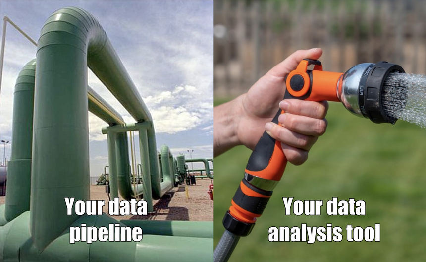
The analysis tools we’re using today are the same ones we were using over 10 years ago when dbt wasn’t even a twinkle in Tristan Handy’s eye. They were built for a world of fragmented transactional databases where data wasn’t clean and even having a reliable KPI dashboard was a big deal. This meant they needed to be heavy-weight, taking on a lot of the tasks which we’ve now brought into the data warehouse and this made them rigid and cumbersome. What originally made these tools great now acts like a throttle, limiting the value we can generate from our new robust data pipelines.
Our realisation back at the end of 2021 was that until there was a better way to create and share insights around the business and level up this “last mile” of analytics, the modern data stack simply wasn’t finished.
Make Analysts Great Again
We certainly had enough evidence a change was needed. In our user interviews, data analysts were telling us they were frustrated and undervalued and this trend was also visible in the industry data. In StackOverflow’s 2019 & 2020 developer survey data analysts were listed as the least satisfied role in tech whereas data engineers were one of the happiest².
Whilst there’ll be a number of factors at play here, it’s hard to ignore one of the most obvious. While newly-hired data engineers are getting stuck into building their DAGs and setting up YAML files, the data analysts’ world has hardly changed. They’re still stuck on the dashboard train, building report after report hoping that something hits home.
It was this underlying sense of futility that led us to believe our notebook didn’t go far enough. All of the biggest frustrations voiced by analysts were the result of their interactions with stakeholders (and the feeling was mutual). The way they were working wasn’t exciting anymore, something needed to change and the solution would be core to solving the last mile of the data stack.
Breaking down the wall between insights and decisions
As we dug deeper we realised one big cause of this pain was down to some of the fundamental design principles that the whole data analytics industry had adopted at the start of the data revolution but had since never changed. Let me show you what I mean with an illustration…
Below is an image of a sales metric. You can get to an output like this in literally 1000s of data tools.
Some of these tools focus on how fast an analyst can build insights, some on the quality of their aesthetic, and others index on self-service and the range of user groups who can create numbers. But with all these tools, the focus is getting tothe number.This made sense at the start of the data revolution because getting to a number was the most important thing. But now, in most part because of the MDS, it’s something we’re pretty good at. Getting to a number isn’t the problem anymore, the problem is making sure these numbers are actuallyusefuland that’s something none of these different approaches to data tools really tackle.
What makes a number useful isn’t the way it looks or even how accurate it is (though that is important), it’s about the wider context it sits in. It relates to how well the number is defined; how clear the context is in which it is needed; where and when the number needs to be seen and by whom; which conversations take place as a result of the number; the quality of any follow-up analysis used to explore a potential course of action and ultimately whether a decision is taken or a consensus reached.
In short, the usefulness of any piece of analysis depends on the communication between the persondoing the analysis, and the persondoing something with that analysis.
This is something that current data tools do effectively nothing to support. At their core, they are chart-making machines, optimised to let analysts build charts and queries and then publish those charts as “read-only” assets to be consumed somewhere else. This design decision creates a wall between the analyst and the business.
We’ve listened to 100s of stories from analysts of the pain and frustration of trying to build and share insights (we’ve even tried to make light of them in the past). Their lives involve an endless stream of ad-hoc requests and follow-up questions, poorly defined requirements that lead to large amounts of rework, or far too often, analysis that never gets used.
At the root of this pain and inefficiency is the data tool. It creates a barrier that hinders the interactions intrinsic to reaching a great outcome quickly. Our core belief was that if we want to improve how data was being used within the business we needed to build a data tool that:
- Brings the business directly into the analytical process.
- Goes beyond chart creation and supports the collaborative activities which turn insights into outcomes.
- Leverages the power and stability of the modern data stack to provide a more flexible way to work with data.
The canvas - turning data into a multiplayer sport
And here’s the result. The Count canvas!
The canvas is a shared space where data analysts and their stakeholders collaborate with data. This sounds simple enough, but to do this fully has required taking a sledgehammer to the normal definition of what a data tool is. The canvas combines the best of a digital whiteboard with the power and flexibility of a SQL IDE and data viz tool. The result is the first data tool that supports theentireanalytical workflow. Problem definition, data exploration, modelling, presentation, and discussion all happen in one flexible real-time document.
The canvas is designed to simplify the messy nature of analytics, maximising the creativity and problem-solving skills of analysts and slashing the total time it takes for teams to solve problems with data.
It’s the result of many late nights, wrong turns, and countless conversations with our most daring notebook customers. Their willingness to experiment with not only a fledgling product but also a brand-new approach to analytics taught us more than we could have imagined.
For all of them, the canvas has now replaced the notebook as their primary analysis tool, and below I’ve summarised the three core principles which define how they now work:
Solving problems together
As I touched on earlier, one of the most common themes of our user research was the transactional nature of a data analyst’s workflow. Data requests come in, dashboards go out with a few slack messages scattered in between. The analysis is complex and great questions are nuanced but this day-to-day workflow leaves no medium in which better conversations can happen.
To truly solve problems with data means you need space and flexibility to work and a way to communicate and iterate quickly. The white-boarding tools in Count are therefore one of its most differentiated feature sets. They not only allow analysts to clarify requirements and narrate their work, but they also broaden their role and lets them participate in problem-solving rather than just being the chart builder. Teams can bring the entire analytical workflow into Count, combining the wider context of a problem together with their analysis so they can structure their thinking, draw conclusions and iterate quickly towards a solution.
The space and flexibility of the whiteboard also allow teams to dig much deeper. The image below shows the result of a deep dive our own team did a few months ago into user activation.
Each area of the canvas corresponds to a different line of inquiry and allows us to lay everything out in one place. If you look closely, you can see how we combined flow diagrams, screenshots, and even drawn sketches with over 50 visualisations to reach a conclusion. It may look a bit scrappy, but the ability to be able to explore and present ideas without the need to dance between a SQL IDE, google doc or some heinous powerpoint was much faster and far easier to audit.
Embracing radical transparency
As anyone whose been an analyst will know when you share a notebook or dashboard, you will always expect to receive a flurry of follow-up questions as your audience tries to understand and ultimately determine if they trusted what they were seeing. This is made especially difficult because so much of the assumptions and logic is hidden away behind the wall in the data tool.
With the canvas, the “how” is now as easy to share as the “what”. Analysis and results are displayed side by side with each step of the analysis visible and distinct because of cells.
Cells are the atomic units of analysis, each cell can reference the results of any other allowing code to be modularised and laid out clearly. This offers the same workflow benefits as a notebook, but whereas a notebook has to be viewed linearly the canvas has an extra dimension so analysis can lay out their thinking spatially aiding comprehension.
Sharing your work by default is a big cultural shift, but when it's made the benefits are profound. The canvas allows everyone to walk through the logic easily, building trust, agreeing or tweaking assumptions, and seeing the changes reflected instantly in their outputs.
Delivering outcomes through creativity
Finally, the scale of canvas turns it into the most flexible reporting in the world. Users can turn any area of the canvas into a production report of any shape or size. Dashboards, notebooks, and even slide decks can all be made from the same canvas document.
We’ve been amazed at the breadth of outputs our users have created to bring their analysis to life. As one user said recently: “What I can build in the canvas is only limited by my imagination.”
Building simple conceptual structures like a hierarchy or a flow diagram, which are almost impossible to create in a dashboard or notebook tool, has just become the default way data is shared. This opens up a new frontier of contexualised reports where complex business processes can be expressed in full context.
Moving beyond the notebook
All the benefits above combine to form a very powerful cocktail, creating a very different workflow for data projects. As our users start collaborating more and more through every step of the analytical process, we’ve seen their total project time drop by up to 75%.
But the most exciting impact of the canvas has come from seeing a different working relationship emerge. The canvas elevates analysts from being a source of information to becoming core participants in the wider problem solve.
Analysts are amazing problem solvers but these skills have, to date, been hidden behind the dashboard out of sight. The canvas puts their expertise on display, turning them from a “chart monkey” into a trusted advisor. It’s this which keeps us motivated and makes us confident we’re on a path to bring data analysts fully into the modern data stack and make analytics a team sport.
If you’re interested in bringing more creativity to your data work, cutting down time doing ad-hoc analysis, and driving your data culture forward we’d love to hear from you.
You can learn more and request access to the canvas atcount.co.
¹ That’s what my Mum said at least 😅.
² Data or business analysts had the highest % of responses of either ‘slightly’ or ‘very’ dissatisfied in both 2019 and 2020 surveys. Conversely, data engineers and data scientists scored in the top 10 roles for satisfaction in the same years. The question was removed for 2021 and 2022.