The Tableau Era is Over
Written by The Count Team

Tableau's era ends; embrace data canvases for storytelling and collaboration. Move beyond dashboards to empower data teams and enhance analysis. Discover the future with Count.
[YouTube Video: https://www.youtube.com/embed/STyoFDL9byk?feature=oembed]
The announcement last week that Tableau’s CEOAdam Selipsky is stepping downfelt more significant than the casual media coverage it received. To me, it was a signal that the murmurings of discontent I’ve been hearing were true: Tableau is over.
The Glory Days
While Tableau first came about in 2003, they really hit their stride in the early 2010s — and what a stride it was. Users heralded the tool as ‘revolutionary’ and ‘life-changing.’ Their annual conferences sold out in minutes. Participants would come together with hundreds of others, proudly brandishing swag that read ‘We Are Data People’ as they attended roller-blading socials and “Iron Viz” competitions. Like I said, it was having a real moment.
To understand the hype, it’s worth remembering life just before Tableau hit the scene. Back then, “data” teams were really just a few IT people building some SSRS reports, or the designated “numbers guy [sic.]” who knew how to use Excel. People fighting to inject data into the organization had little but a spreadsheet and a dream.
By making data look good, and easy to interact with, Tableau became the way to soften the delivery of data to the rest of the business. We replaced cold spreadsheets with bright, intuitive dashboards that were accessible to anyone at any time. In return, data got a seat at the table, got invited to more meetings, and got teams of their own.
For many of us (I, too drank the kool-aid), it was affirming and exciting to see data being celebrated, not relegated to the sidelines. Tableau told us being in data was not just cool, but also irrefutably important.
What's Changed
We live in a very different world than that of the Tableau Glory Days. Data no longer needs advocating; indeed most companies are experiencing peak Data FOMO (Fear of Missing Out). With all the data science hype, they can’t throw enough resources at the data problem.
But instead of this being an even more glorious Glory Days, it’s an all-too-often underwhelming experience all around:
“Machine learning specialists topped its list of developers who said they were looking for a new job, at 14.3 percent. Data scientists were a close second, at 13.2 percent.” [1]
And even more damning:
“Among the 90% of companies that have made some investment in AI, fewer than 2 out of 5 report business gains from AI in the past three years.” [2]
Eesh. Clearly, there’s work to be done.
The Haunting
While it’s important to recognize Tableau has enabled our current era of well-deserved attention and investment in data, we must also call out the challenges left in the wake of its reign so we can take advantage of our current opportunity.
So what are these ghosts that are getting in our way?
Data === Dashboard
To many business users data is now synonymous with dashboards. While a seemingly benign misunderstanding, this actually causes a whole slew of downstream effects, namely:
- Thinking Tableau will ‘fix’ your data problems. Many companies make the mistake of assuming the only thing your data team needs is Tableau (or Power BI). This kind of thinking ignores the more common pain points of bringing data sources together, cleaning and transforming the data, and doing the actual analysis itself, which, if you ask any analyst, are the most traumatic parts of any analysis. By not investing in these problems, you’re telling your data team that their work is less important than the business’s interpretation of it.
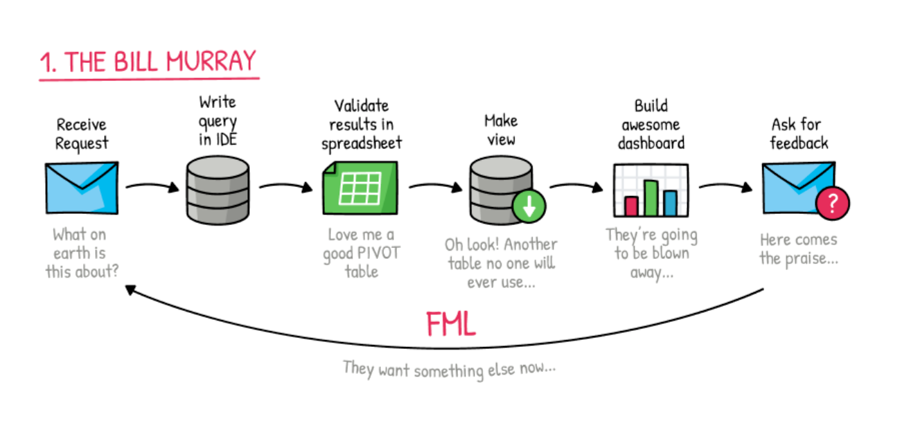
- Asking dashboards to do too much. Since Tableau is the only tool many teams have to present data they are forced to turn everything into a dashboard which significantly reduces the impact a more nuanced, thoughtful analysis could have. By stripping away context, explanation, and narrative from the analyst, dashboards become a Rorschach test where everyone can see what they want to see.
- While users are now more comfortable looking at basic charts, we’ve made little progress in educating our business partners in fundamental data concepts. Dashboards don’t give us the stage needed to explain, for example, why correlation does not equal causation. This means it’s become nearly impossible to explain the significance of our more complicated predictive models or statistical analysis which are required to realize the dreams of our current era.
Hyper Specialization of Tools

One of the great things about Tableau at the start was that it just sat on top of your database, making it easy to ‘plug in’ to your existing stack of data tools without much effort. This model has been used by pretty much every data tool since, creating separate tools for data pipelines, data cleaning, data transformation, data analysis, and of course, data visualization. This approach is completely fragmenting analyst’s workflows, causing significant pain and delays in each analysis they do. As a result, most analysts and data scientists have adopted a ‘not my data tool’ mentality — acknowledging Tableau as a necessary evil to get their work noticed. Check out this Redditthreadto see for yourself.
“If there were a button that would nuke all the Tableau servers in the world, I am pressing that button.” -Anynomous
Remember those ‘murmurings of discontent’ I mentioned at the start…
Ghostbusters
We have an increasingly urgent need to find solutions to these issues before we find ourselves again fighting for relevancy and attention to data. To do that, we need to start focusing on the following two areas:
Present more than numbers

It’s time to give data more of a voice. Dashboards are great for things where there’s a shared context and a straightforward decision, but for many things, those conditions are not met, and therefore we need a new approach.
I, and others, have been banging the drum on data canvases as a solution for some time now. They can tell the story, explain the methodology,andbuild nice visuals without sacrificing interactivity or presentability.
By using more workflow-centric tools we can start to wean off a culture that’s been jonesing for dashboards. We can start to workwithour business partners instead of lobbing questions and charts back and forth over an imaginary wall.
Pick tools the data team wants
Data analysts and scientists see a red flag when a potential employer has Tableau and little else in the way of data engineering, or data analysis tools (e.g. running Tableau on your un-transformed MySQL 5 database). This signals that they aren’t prioritizing the work that these analysts will do. This needs to stop. ASAP.
Depending on the analysis your team is doing, the ‘right’ tools will differ. But there are so many options out there, you just need to make sure you’re investing in the work it takes to make the great analysis as much as you are on a tool to make the business look at it.
And hey, you’ll probably end up keeping some of those data scientists that are, according to the stats, most likely shopping around.
Conclusion
We all owe a great deal to Tableau for the current attention data receives in our businesses. To make good on this opportunity though, and move into a new Golden Age of data, we need to address and remedy some of the ghosts of the Tableau era that are holding us back.
Data canvases present an option that can give your team the flexibility it needs to start to move past Tableau and into the next era.
At Count, we’re excited to be part of this new movement of data tools designed for modern challenges. You can learn more about the Count canvashere.