Demystifying dbt models at scale
Written by The Count Team
Streamline data pipelines with Count: Enhance transparency, collaboration, and speed in managing 400+ dbt models and 30+ data sources, delivering outputs 3x faster.
Justin Freels, Senior Manager of Data Engineering at The Stable, part of Accenture Song, recently sat down with Count’s Mico Yuk to talk about his experiences and challenges managing a large-scale data stack that sources data from over 30 platforms, is transformed across over 400 dbt models, and serves hundreds of customers. He and Mico break down how the Count canvas has helped his team build a truly transparent data pipeline, work more closely with stakeholders, and deliver final outputs 3x faster.
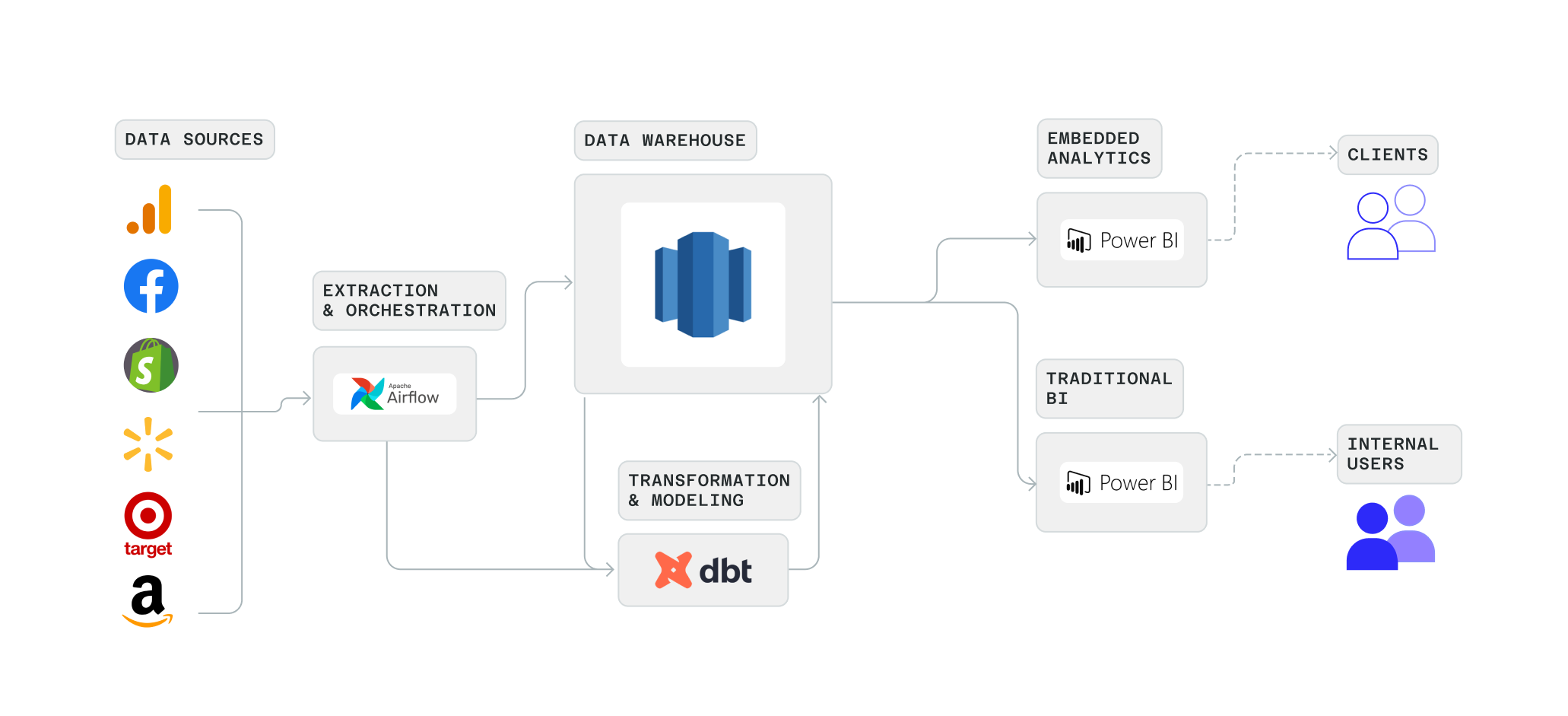
The Stable, part of Accenture Song, helps brands build digital commerce channels and understand their performance across various retailers. For Justin’s team, this requires maintaining a complex pipeline of data. Data is sourced from a variety of retail (e.g. Walmart, Target, Amazon, Shopify) and media (e.g. Facebook, Google Analytics) sources, then merged, transformed, and presented as internal reports, and shared with clients via an embedded analytics platform.

While equipped with many best-in-class tools (Airflow, dbt, and PowerBI), Justin and his team were bogged down in managing a stack with over 30 sources and 400 dbt models.
“Day-to-day we’ve always been focused on the same things: How do we onboard new data sources, model all that data in dbt, present it from a reporting perspective, wrap all that securely, and expose it to clients? But our stack required a ton of overhead, and very different skill sets to manage each part.”
Soon after Justin joined, he found Count and having already been a fan of tools like Figma and Figjam, he instantly saw the potential for the canvas to lift his team out from underneath the weight of their stack, and allow them to work on the things that really matter.
Pulling back the curtain
While dbt and Airflow are excellent ways to orchestrate and manage complex data pipelines, they offer only glimpses into what’s really happening with your data under the hood. The canvas let Justin and his team look at their data pipelines with unlimited transparency.
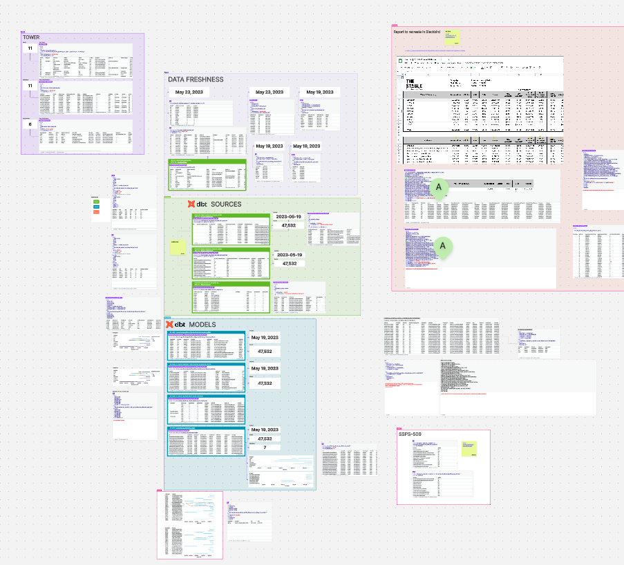
“We have entire canvases that are dedicated to a platform or use case. We show the whole data lineage: the sources, the model queries, and the actual data. We put sticky notes on everything.”
For a team with so many sources and models, this transparency was essential to make sure their models were accurate, and to have complete confidence in what each model was doing.
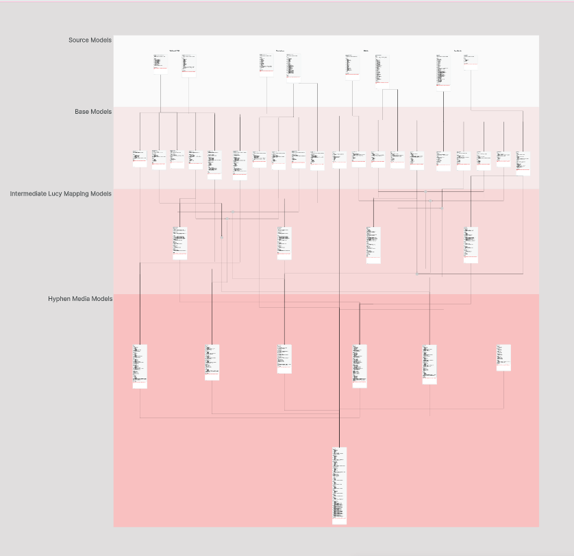
Aside from letting his team see all the logic and results in one place, these canvases allow them to do something that was impossible before: work together.
“You could share your screen, or take a screenshot of DataGrip, maybe fumble around with something directly in dbt. But, really there was no collaboration.”
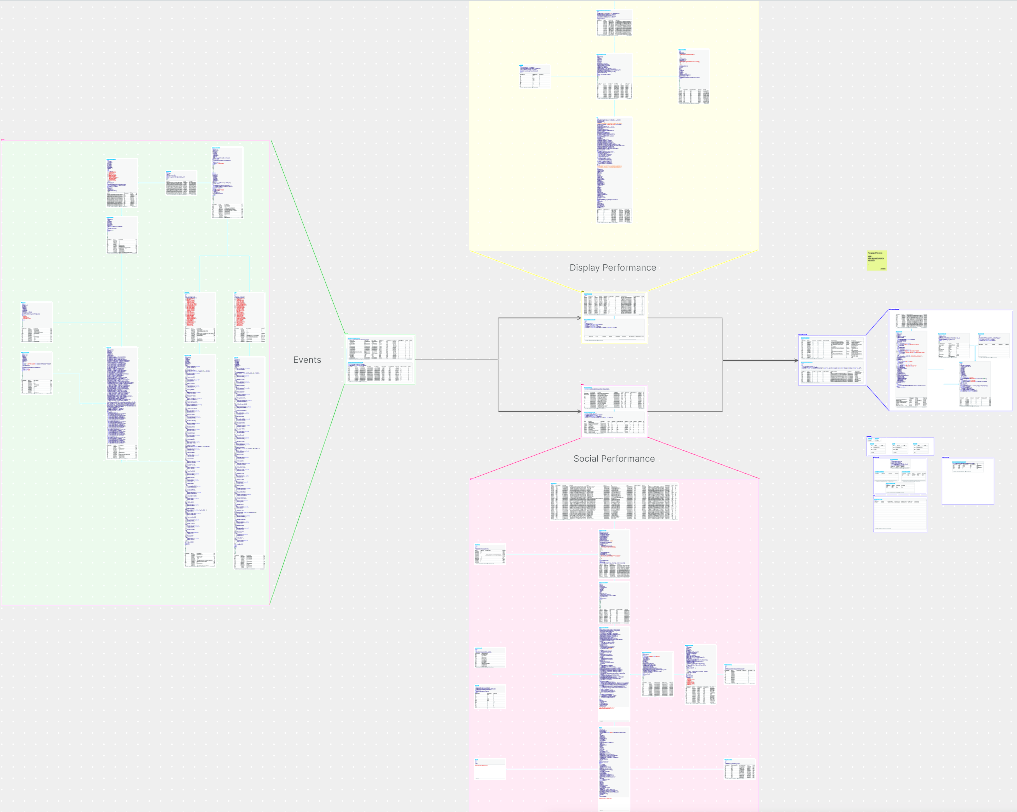
It may seem simple, but the change is dramatic. In canvases like the one above, Justin and his team can work through logic together, find bugs faster, and discover methods to refactor and improve their transformations.
Beyond the data team
The best data models represent the real world with clarity and accuracy. To do that well, data engineers must work closely with their business stakeholders. Before Count, this was a luxury rather than a fundamental part of the process.
With their data models mapped out step by step in the canvas, Justin’s team could now share a link with a Product Manager and ask for feedback, or instantly answer when someone asks ‘Hey, do we have data for this?’.
The canvas quickly became a common space where Justin’s team of data engineers could work with the rest of the business. For instance, it’s common for Justin’s team to get asked questions about data quality (e.g. ’this number looks wrong’). Debugging in the canvas not only lets Justin’s team lay out the entire end-to-end code that might be erroring in one place, but it lets stakeholders join in to find erroneous business definitions or help provide context Justin’s team doesn’t have.
🙋
To learn more about the Count <> dbt integration, you can read the launch posthere.
Collaboration as a means to move 3x faster
Working closely with stakeholders has not only helped them build better models but has let Justin’s team go faster.
“The speed from question to answer has dramatically increased just because people can actually see the data. It's not just a nebulous concept. It’s a conversation.”
The canvas has not replaced any part of their stack but rather helps Justin’s team use those tools more effectively. For example, when they are asked to build a new dashboard in PowerBI for a new client, they can prototype that entire flow in the canvas first. They can map out the transformations that will be saved to dbt, they can do the key analysis that powers the dashboard, and even mock-up dashboard designs all in the canvas. Then they get feedback from stakeholders and iterate quickly until they all agree. It’s only then that they create their dbt models and build their dashboards in PowerBI.
“We’re not replacing those tools, we’re simply using [the canvas] to be able to make those tools more productive.”
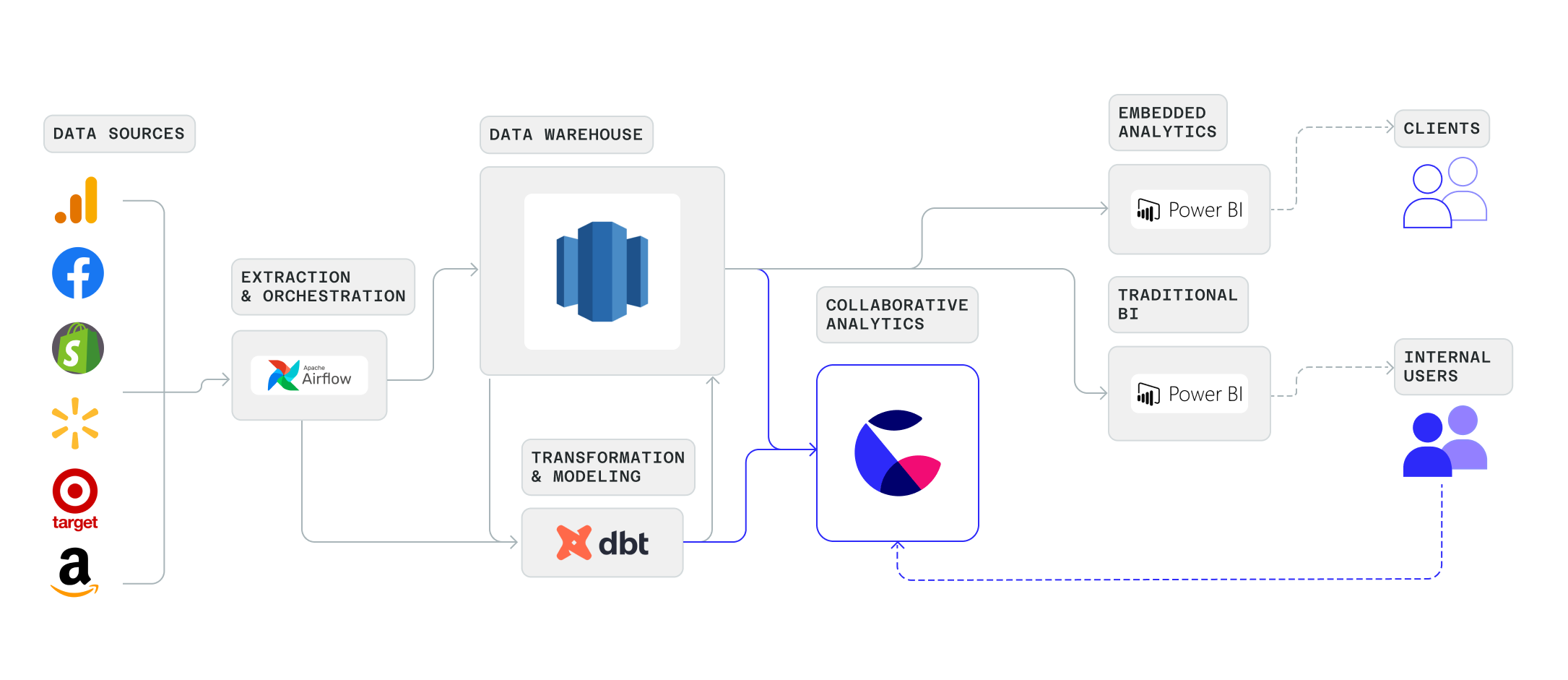
For Justin’s team, this also means spending less time with heavyweight solutions when they don’t need to. For internal data quality reports, like the one below, they used to have to build them in PowerBI, which took time, and was a skillset not everyone on his team had. The canvas is a lightweight solution that gives his team the info they need without being bogged down by unused functionality.
Looking ahead
Like all data teams, Justin wants to continue to get more and more people involved with data:
“There is so much value in just giving people the ability to see things, then be able to ask questions. We want to get more people involved with data so that they don’t have to know SQL, they don’t have to know Python. They can still engage with the data and ask questions without having to do it all themselves. I don’t see us achieving that without Count.